No matter how much deliberation goes down, there’s a moment in every renovation when a homeowner straddles the line between excitement and apprehension. For Dallas philanthropist Jennifer Karol it happened during the installation of her master bathroom, a striking black-and-white space that’s anything but minimalist: The shower is all geometric and arabescato marble tiles, while the vanity area unites terrazzo flooring with a graphic Pierre Frey wall covering that depicts naked figures in various states of embrace. Though Karol’s flair for the dramatic helped inform the decision, the mix was the brainchild of husband-and-wife design team Corbin See and Sara See, of the family-owned Oklahoma City interiors firm Sees Design. Karol remembers, “I called Corbin and said, ‘I think maybe we’ve done this pattern mixing ad nauseam,” to which he replied, ‘But don’t you think it’s a symphony?’”
By all accounts he was right—and it became just one in a slew of calculated risks the collaborators took throughout the nearly 12-year process of transforming Karol’s contemporary Bernbaum/Magadini–designed house into a fashion-forward residence that balances her need for serene, comfortable interiors and her love of pushing the envelope. “I like some type of flash in every room—a pop of red or a pop of gold,” she says. Adds Corbin, “She’s very decisive. She knows what she wants and doesn’t compromise.”
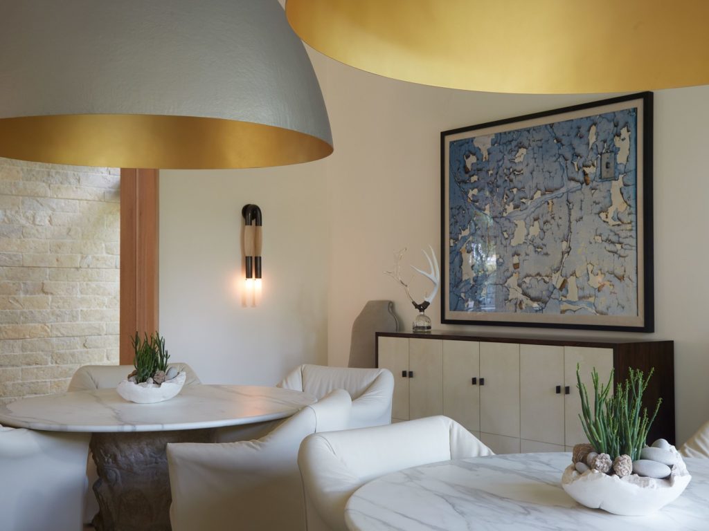
A pair of gold dome lights by Ingo Maurer hangs above two small Formations tables instead of a traditional rectangular table in the dining room. “I like round tables because the conversation is better and livelier,” Karol says. “When I go to dinner parties, smaller tables just seem to be more fun.” The chairs are by Cassina, the sconce is by Apparatus Studio, and the sideboard is by Holly Hunt.
Take Karol’s bedroom, part of a 280-square-foot addition intended to open up the house to the outdoors and add closet space for the self-declared “clothes whore,” where the bold purple carpeting is tempered by the tranquility of De Gournay’s Willow wallpaper. “It’s soothing, but there’s a definite point of view,” says Sara, a textiles specialist and former design director of Perennials Fabrics. The same is true in the dining room, where Corbin aligned two marble-topped round tables beneath massive gold dome lights by Ingo Maurer instead of installing a traditional rectangular table. “I like round tables because the conversation is better and livelier,” Karol says. “When I go to dinner parties, smaller tables just seem to be more fun.”
That vivacity manifests itself in nearly every room of the house, from the Deco-inspired ostrich-feather lamp in the living room to the colorful Memphis Milano cabinet in a hallway. “That’s the beauty of working with someone like her: Everything is fair game,” says Corbin. “Sometimes you get a client who is willing to do one of these things; she was willing to do all of them, and it just works. But that’s another thing about design: Good stuff just goes together.”
Though many pieces have come and gone over the course of the house’s room-by-room reinvention, the sense of effortless elegance that pervades the space remains. “We were always mindful of the domino effect, but we also wanted it to feel like there was a sense of serendipity,” says Corbin. “Her whole deal for the last 12 years has been, ‘Don’t think too much about it. Don’t make it design.’ Which, of course, is impossible for a designer.” It helps that they’ve found a client who is as comfortable taking a wait-and-see approach as a pull-the-trigger one. “It’s like a wardrobe: You’re constantly editing. You have to let your ego go in the name of changing and growing and refreshing things,” Corbin says. “The job is only as good as the client, and we are constantly evolving together.”


