McDonald’s may be home of the Big Mac, but its branding just went minimalist.
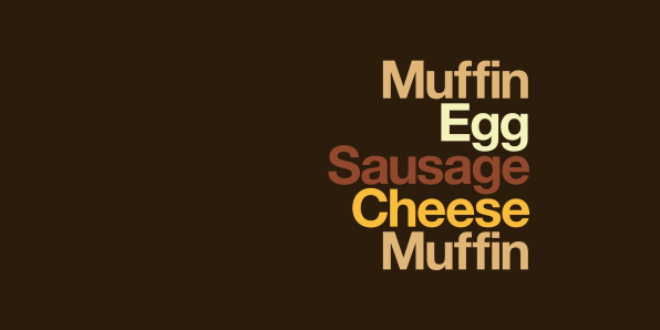
The ad agency Leo Burnett London worked with American designer David Schwen to create a new outdoor branding campaign for McDonald’s called “Iconic Stacks.” Dollar menu aficionados will recognize McDonald’s classics like the Sausage McMuffin, Big Mac, and Filet-O-Fish by a list of ingredients in McDonald’s brand colors and what appears to be the typeface Helvetica on each sign. But there aren’t any other hints as to the brand behind the ad.
This is just the latest example of McDonald’s embracing a minimalist aesthetic. In 2016, the company unveiled new, spartan packaging to replace the busy bags and wrappers it used for years. It’s also part of a larger trend of “no-brand” branding—pared-down visuals that rely on brand equity, the consumer’s established relationship with the company, and knowledge of its products as identifiers rather than overdesigned labels and slick slogans to get the message across. Startups Brandless and M/F People both launched in 2017 with products that had so much white negative space, they were almost blank slates.
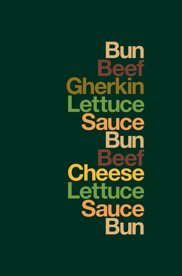
The stacking type conceit may be familiar to people who know Schwen’s work. In the design community, he’s well-known for making “type sandwiches” that describe what a sandwich is made of by stacking a list of their ingredients on top of each other. Heck, we could go back even further for the start of the trend—add ampersands to “Iconic Stacks” and you have Experimental Jacket’s eponymous “John & Paul & Ringo & George” T-shirt created in 2001 for 2K/Gingham, and copied in every possible variance since.

“Iconic Stacks” isn’t the image-centric food porn typically used for food and restaurant marketing. But much like a set of chimes to Pavlov’s dog, McDonald’s is banking on the fact that the words alone will still make you salivate.