The main room. Photo: MICHAEL VAHRENWALD/ESTO
Postwar white-brick studios, with their galley kitchens and low ceilings, are always practical yet rarely inspiring. But Danielle Rago wasn’t about to let that stop her. “I have been around architecture and development my whole life,” she says. Her father is in commercial real estate, and she interned at architecture firms in the city. After getting her master’s degree at the Architectural Association in London, she moved back to New York. Then, in 2013, her boyfriend (now husband) got a job in Los Angeles, so they moved out west, where she co-founded a design-consultancy firm, This X That. Still, she missed having a place in New York.
When her sister, who had been living in a studio owned by their family in a white-brick postwar in Gramercy since 2012, adopted a dog and decided she needed more space, Rago thought it might work for her as a pied-à-terre. So she decided to renovate it.
The main room and kitchen before the renovation. Photo: Courtesy of New Affiliates.
The main room and kitchen before the renovation. Photo: Courtesy of New Affiliates.
Rago turned to Jaffer Kolb and Ivi Diamantopoulou of New Affiliates (which is also represented by This X That). The project required that the 450-square-foot space, which had been dominated by her sister’s bed and sectional sofa, serve as a place for both meetings and entertaining as well as become a minimalist crash pad at night. The keys to the transformation? That age-old, reliable space saver, the Murphy bed, plus a new, custom-designed “pleated” wall built the length of the apartment to conceal new closet space. “We thought of it as a Swiss Army knife,” Kolb says.
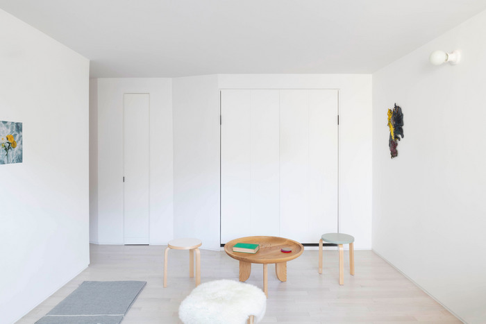
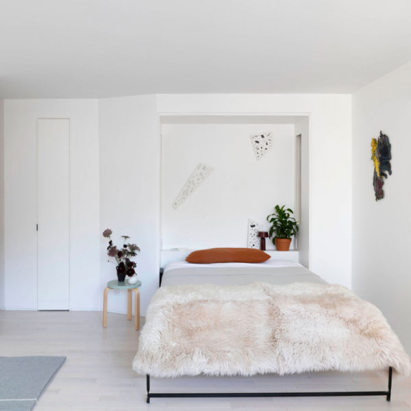
“[For the main room], we had to think beyond the specifics of designing a living space. The apartment was meant to be highly flexible,” designer Jaffer Kolb says. “We installed new flooring all across the apartment. We chose a narrow wood plank that makes the spaces feel more generous.” The pre-finished wood flooring is from Mirage’s Admiration Collection in Red Oak Nordic. A new wall of storage space runs the length of the apartment. New Affiliates designed the custom Murphy bed to blend in with a wall devised for storage. There’s enough room to house bookshelves on either side of the bed.
The Main Room: Here, the Murphy bed is hidden away. The wall sculpture is Nonlinear Shapes, by Kai Franz. “Previously, the lighting was via floor lamps. We added wall sconces to bring even light from above,” designer Ivi Diamantopoulou says. This sconce is from Schoolhouse Electric. Subtle details like replacing all the electrical outlets and switches modernize the look of the space. Photo: MICHAEL VAHRENWALD/ESTO
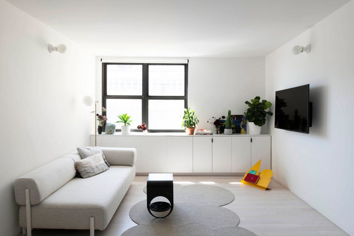
The View Toward the Window: The HEM-designed chaise, which sits where the bed used to, can be used as an extra bed when needed. The handmade wool rug is by Grain from Colony Design, and the discreet wall sconces are by Schoolhouse Electric & Supply Co. The new wood floors help brighten up the room, as do the plaster-concrete ceiling surfaces, which reflect light. Photo: MICHAEL VAHRENWALD/ESTO
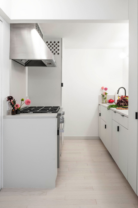
The Kitchen: “We wanted to keep the materials simple, light, and clean,” Kolb says. The new kitchen is in the same place as the old, but a wall and a door were removed to open it up. All of the appliances are by Miele. The overhead cabinets were removed. The countertops are by Caesarstone in Fresh Concrete. The floor tiles were replaced with the same wood flooring used in the rest of the studio. Photo: MICHAEL VAHRENWALD/ESTO
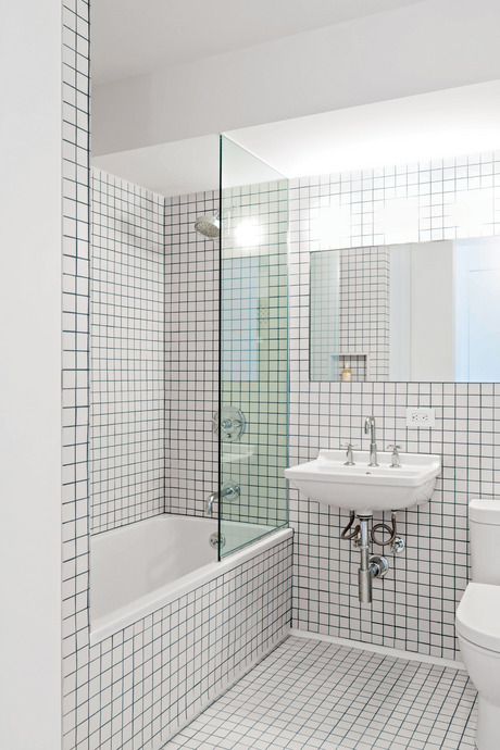
The Bathroom: “We kept the bathroom in its original location but enlarged it by removing an adjoining closet and gaining several feet of clear space,” Diamantopoulou says. A frameless mirror, as well as all-new fixtures, adds to the simplicity. The Nemo tiles are in Superwhite with Twilight-blue Laticrete grout. Photo: MICHAEL VAHRENWALD/ESTO
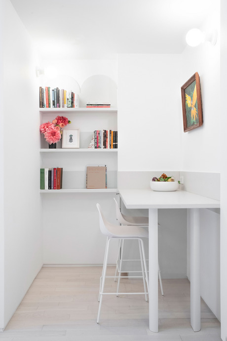
The Office Nook: The architects created this work space by removing the existing coat and walk-in closest. The high desk matches the design of the kitchen cabinets and cabinetry.” We thought this could be used as both a home office, or an extension of the kitchen when needed.” Diamantopoulou says. “The custom bookshelves on the back wall take advantage of the existing wall configuration.” Photo: MICHAEL VAHRENWALD/ESTO
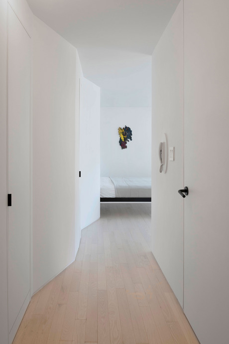
The hallway. Photo: MICHAEL VAHRENWALD/ESTO
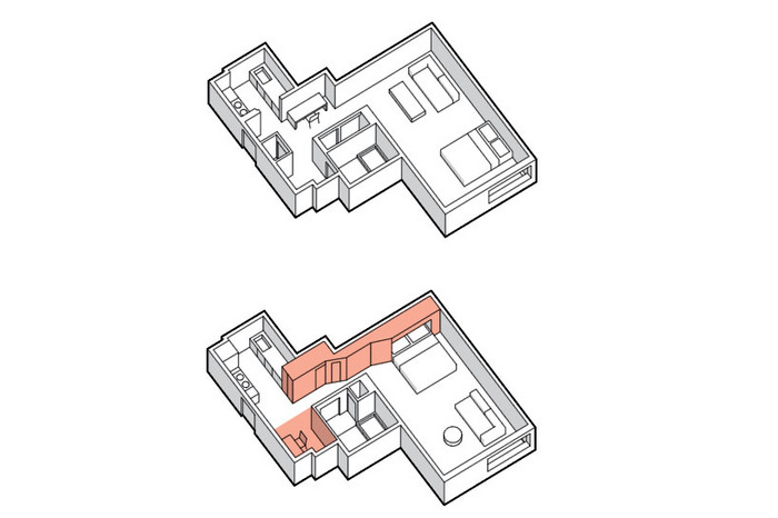
The Pleated Wall: The hallway is now defined by a newly built-out wall that extends from the kitchen to the back of the space. “The apartment actually had over 55 square feet of storage and closets,” Diamantopoulou says, “but because most of that was in dedicated walk-in areas, a lot of it was standing room and was far less efficient in terms of capacity per square foot.” The wall unifies the components while creating the pantry in the kitchen and the storage area outside the bathroom, and it contains the Murphy bed with shelving in the living room. Illustration: Jason Lee
*A version of this article appears in the January 20, 2020, issue of New York Magazine. Subscribe Now!
