You know how you use your smartphone, right? Well if you thought “too much,” you’re not alone. There are plenty of apps out there that claim to help you curb the urges and one of them is called Ratio — it’s a launcher or home screen replacement for Android (it’s actually more than that in some cases) that’s meant to recompartmentalize how you access and consume the things on your phone. But will it help you cut down on your screen time? Well, it turns out that I’m the completely wrong type of person to tackle that question.
Prelude
Ratio is a product from Blloc, an electronics firm proudly hailing from Berlin. The launcher was actually extracted and adapted from a phone the company made a couple years ago called the Zero 18. If you’re curious about that, here’s an explainer from Marton Barcza, better known as TechAltar on YouTube.
The hardware was more or less forgettable, but it was the way Blloc modified Android to dull addictive elements that caught people’s attention. Monochrome viewing was a default, toggled on or off by tapping on the fingerprint sensor, and the rest of the original UI was targeted at reducing your time inside apps designed to keep you sucked in until 3 a.m.
For a small-scale project, the phone sold in respectable numbers, but there was plenty of reaction from those who wanted to Zero18’s modus operandi exported in some way. And, indeed, Blloc capitalized on that demand with closed beta testing earlier this year. Earlier this month, Ratio finally made its Play Store debut.
I have to admit as I come into this write-up that Ratio is entirely not meant for a person like me: when I turn on my phone, I seek either passive distraction such as a podcast or active engagement like researching stuff for Android Police or quickly responding to an email or a hot take on Twitter. But I still think it’s extremely worthwhile to contribute a thoughtful assessment of Ratio from a perspective that isn’t wholly about decluttering your “digital life” or chasing the aesthetic™.
The launcher
Talk of aesthetic, Ratio lays on the minimalism in droves. Aside from some yellow accenting, if it’s not the regular black and white, it’s the white and black of Sun Mode. Some relief is on the way, though, as Blloc plans on bringing in a brighter translucent look — which is great since I miss being able to see my wallpaper. I’ve elected to install Ratio’s own free series of wallpapers, as well as Nate Wren’s Lines icon pack series (free or $2) as recommended by Blloc.
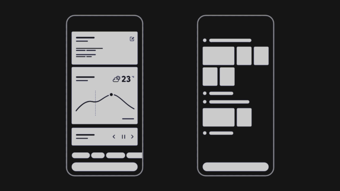
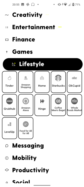
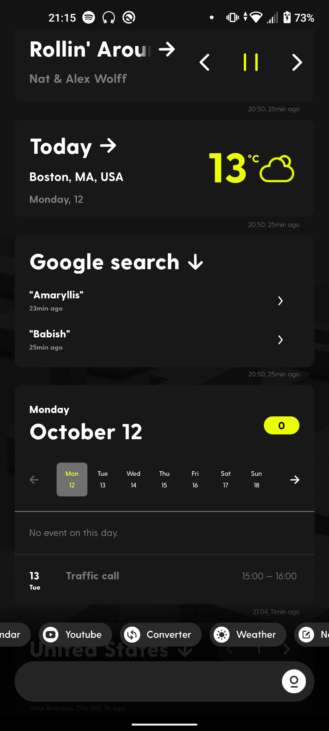
The launcher primarily takes the form of two home screens (soon to be three): the Root is a feed of widgets that you can draw up and cast away while Tiles is where all of your apps live.
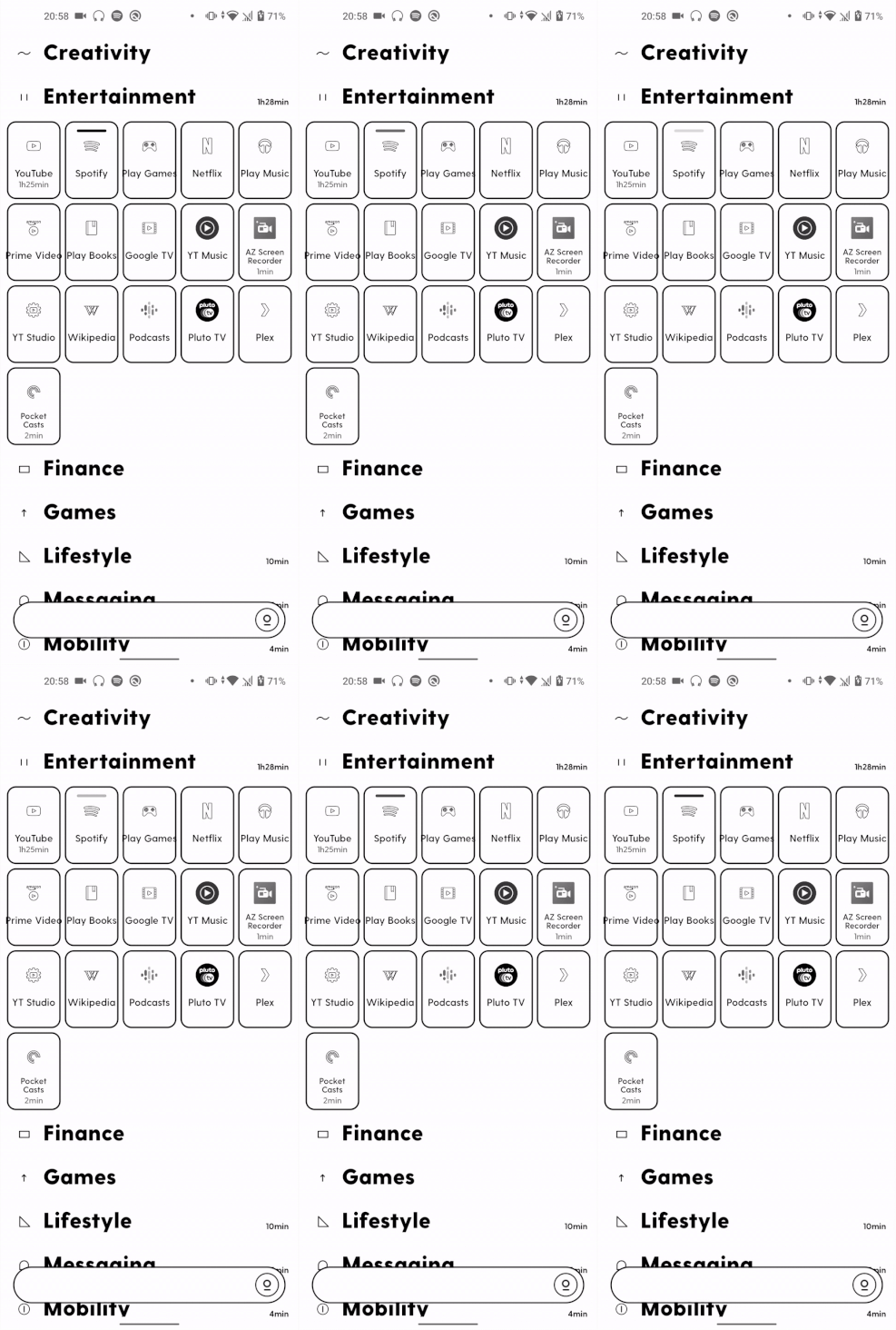
In Tiles, every app must sit in a drawer. Any app that isn’t in a drawer of your creation goes into the generic App Box — as with iOS, there are no duplicate tiles. Ratio has a folder auto-generator that’s able to loosely group your apps into general categories. It does a good enough job, but you’ll probably have to relocate a few loose apps like Wikipedia from the Entertainment drawer or the Weather app from Mobility. Either that or use Ratio’s search bar at the bottom to pull up your app.
Personally, I just can’t get along with this lockup because it prevents me from doing what I want as fast as I want to get it over with. Between the flashing pills on any app with an active notification and having to remember a drawer name, then passing through an array of grayscale icons to get to the one I want, it’s all been a challenge. My home screen cognition path has been wired to hit colors first, then shapes, and then maybe the text if I need it. In the days that I’ve spent with Ratio launcher, I have not been able to realign my tracks. And I don’t think I want to.
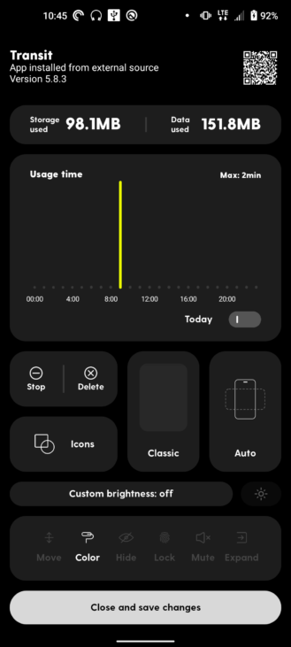
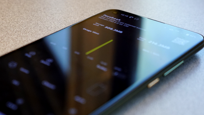
Tapping and holding on a tile brings you into Ratio’s dedicated app settings page which differs quite drastically from the one you get from Android. Front and center are data and usage stats, then options to force stop or delete the app — tapping on the QR code at the top right brings you to its Play Store page. You can select what icon appears from your choice of pack as well as the tile’s backing color. There’s the ability to force screen orientation and exact brightness level and other toggles like requiring biometric authentication for access or browsing the app in grayscale. You can even reconfigure the corner-swipe trigger for Google Assistant to instead toggle color space on the fly.
Those last few features require a permission you’ll need to give via ADB though if you don’t care for such technical foolery, Blloc provides to help with that.
Everything here offers crusts and crumbs of deterrent for you not to overdose on your workaholism or scrolling for doom or thirst except for that biometric lock — good enough to deter peeping kids, maybe, but useless against the Android literate malicious actor because it’s tied solely to the launcher. I’m not sure, however, that these facets all together a full loaf make — in fact, I’m disproportionately convinced of the color space tools’ efficacy to the point where I’d rather ditch the launcher and go with a simpler app like .
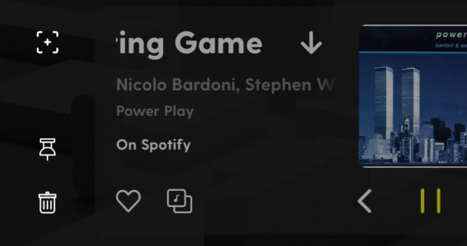
Swiping left over to the Root, Ratio’s search bar is given new purpose as a conduit for widgets. Type in “Spotify” and you’ll get a player. Tap on the card and you’ll see buttons to like the song and copy its URL to your clipboard. Drop “Weather Ottumwa” or “Weather New York” and you’ll get current conditions for a small Iowa city or a giant metropolis. You can also pull up tools like a calculator, notepads, and a currency converter or scan a ticket for your next plane, train, or bus and store it there instead.
Swipe the left edge of the box — not as easy as it seems — to pin it to the feed or can it.
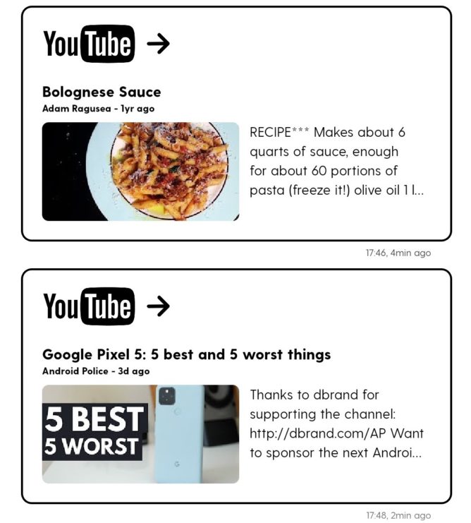
When it comes to drawing on more timely pieces of media like YouTube videos or news articles, the Root misses more than it hits. Sure, you might pull up Android Police’s quite recent video on the five best and five worst things about the Pixel 5, but I’ve seen Adam Ragusea’s year-old video recipe of his Bolognese Sauce about three dozen times (no joke) and would very much like a newer video, please.
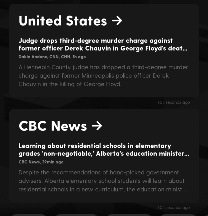
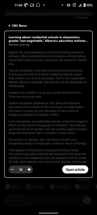
News is in even more of a sorry state because Ratio prefers to orient towards publications or large geographies rather than user-customizable topics. That means you’ll type in “News TechCrunch” and get a random story from the last however-many-days-ago about SoftBank for god knows what reason. We certainly wish Blloc took influence from Google News in that regard.
A neat thing you can do with the articles Ratio sources first-hand and then decides to feed to you is be able to read them without having to open a web browser — just plain text with no pictures or video. I do have trouble reconciling this experience as a journalist, though, as it denies publishers ad revenue and staff the chance to deliver stories in their intended context.
I believe that if Google was only attuned to do everything it can save for suggesting related content topics based on all the data it harvests from us one way or another, we’d be better off as a society. That if we, the end users, were nudged to constantly seek out new information and interests, we wouldn’t be so easily and cheaply prone to algorithms with machine learning decay leading us down rabbit holes we can’t come out of. By design, the Root might be able to provide what we need to know without giving us too much of what we might possibly maybe want to know — for better or for worse.
Image:
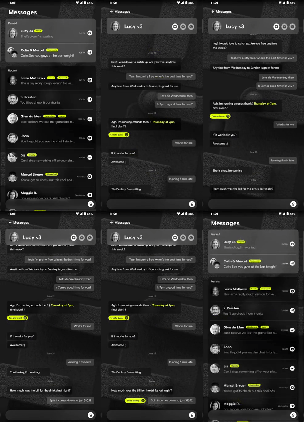
Finally, and integral to Blloc’s future monetization, there’s the unreleased Tree panel. It’s supposedly akin to BlackBerry Hub and other such aggregators of the past where you could maintain conversations with one of your contacts across multiple platforms on one thread. The challenge in getting there is how it pulls chat logs from Facebook Messenger, Snapchat, WhatsApp, and the like when it doesn’t have the system-level permissions to do so. The company says Ratio may be able to assemble them ad hoc by skimming message notifications, but we’ll have to wait and see if that’s a reliable method.
Once again, we see another exercise in keeping users off apps and depriving them the opportunity to get lost in endless streams of content. That said, it’s in personal and intimate conversations with your family and friends that you’re bound to pull up clips and GIFs on the fly not just as an expression of your immediate feelings, but of your love for them. Whether Ratio proves a compromise here isn’t quite clear to me — I’d like a run at it myself before I judge.
Wrap
In any case, Blloc seems ready to put all its chips on the Tree, charging $2 a month or $9 per year just for that feature when it becomes available. The rest of Ratio is free and users are assured that their data isn’t processed online or sent to third-party services.
Whether Ratio will actually work for you, well, as folks say, the mileage will vary — maybe you count that in minutes of screen time saved or the things you do off your phone. How long you’ll stay with this launcher will most depend, I think, on your feelings about how the hurdles to that dopamine and the needling reminders of how much time you’re spending are presented. Make no mistake: they’re clear and abundant here.
QR-Code
Developer:
To access all of Ratio’s features, download Ratio’s ADB tool .
