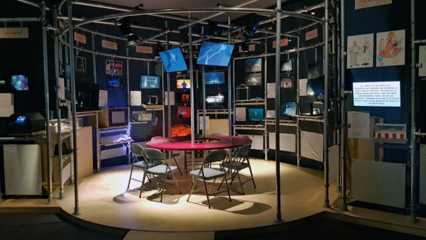
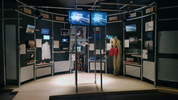
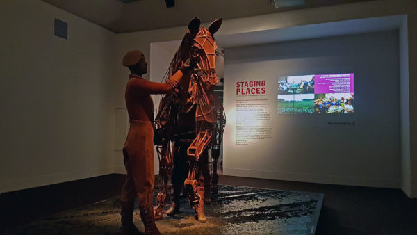
As much as the play itself and the actors, one of the dominant features of a play or musical is the stage design, and an exhibition is currently looking at that aspect of the stage performance.
It’s a unique art, crafting a design that not only aesthetically supports the actors on stage, but is also capable of being engineered to fit into the space allowed. Many of us probably played a bit as kids with paper theatre screens (what, you didn’t?) and there’s an indirect relationship with modern computing which use layers that are built up to create a design, whether graphic or webpage.
The exhibition itself though is a collection of small models used to show off the stage layout to sketches and comments about how the stage designer came up with the design.
Stage designs can be fussy – such as a detailed domestic living room –down to the bare minimal, or even in some cases, barely existing at all, and the design is in the costumes and the audience imagination.
As a personal preference, although I have neither the time or money these days for many visits to the theatre, it’s the stage designs that are minimalist and modern in style that I often find most appealing. That may be in part to being introduced to theatre in the round in 1980 at the National as a teenager as much as to seeing the minimalist designs of Edward II on film.
As an exhibition though, it’s visually interesting to see the structure of stage layouts, and if you saw the play in question adds more detail to your understanding of the show.
Otherwise, candidly, it’s a bit of a homage without the necessary detail to explain the why and how of the designs that were chosen. The small display cards needed to be more informative about the stage design, as that after all is what the exhibition is supposed to be about.
The exhibition, Staging Places is in the Theatre galleries on the 2nd floor of the V&A museum until 29th March 2020. Entry is free.


