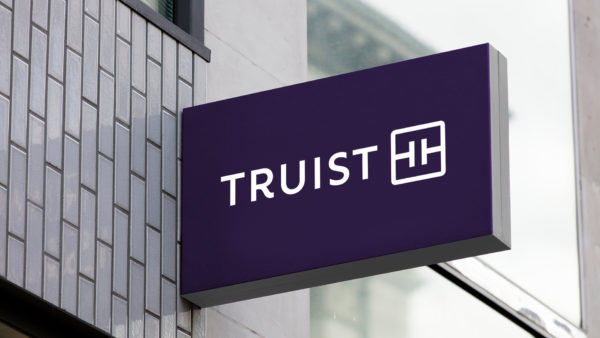
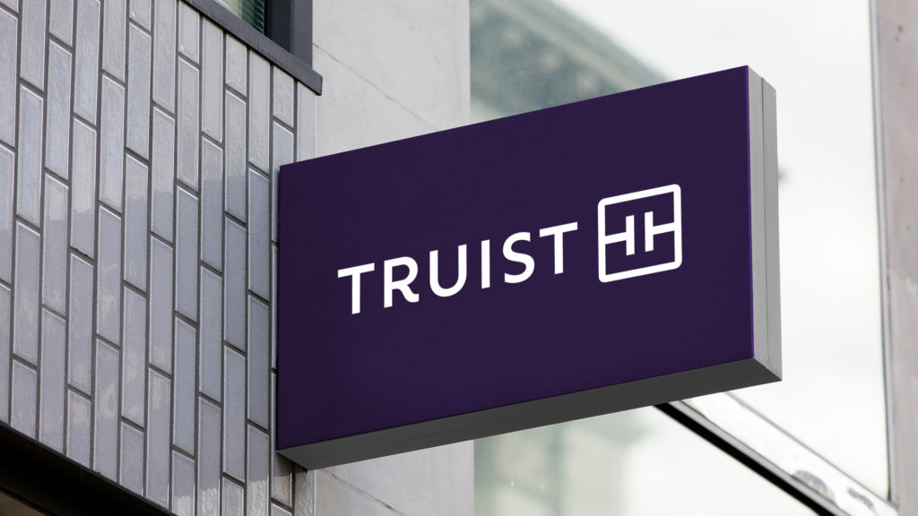
- The combined bank resulting from the SunTrust and BB&T merger unveiled a new look this week.
- It pays homage to both banks’ heritages but reactions were split to the minimalist look.
Truist revealed a new look and feel with a signature color and modern monogram logo. The sixth largest bank in the U.S. is the result of the merger between SunTrust and BB&T.
What the new look is all about: The new visual identity represents the company’s commitment “to inspire and build a better future for clients and communities”.
- Purple: The color purple is a distinguishing feature of the new look and is meant to represent the combination of heritage BB&T burgundy and SunTrust blue.
- Monogram: The monogram is comprised of two T’s that mirror the Truist name and represent Touch + Technology, according to the company.
- Typography: The lettering in the Truist logo was designed bespoke and was designed to be legible in small sizes, like being displayed on a mobile device.

“This striking visual expression is not what most would expect from a financial institution, and we’re proud of that,” said Susan Somersille Johnson, chief marketing officer for Truist. “Our identity is a symbol of the merger of equals between BB&T and SunTrust, which has brought the best of both brands together to build not only a better bank, but a better future for all who engage with Truist.”
Process of designing the new look: To design its new identity, Truist worked with global brand consultancy, Interbrand.
- The bank used focus groups, workshops and interviews to gather input from its teammates and clients regarding the new branding.
- Truist is rolling out the new look over the coming weeks and moths to branches, digital platforms, and out of home advertising in Miami in anticipation of the Super Bowl LIV.
Reactions to the new logo: The new logo received mixed feedback on social media. Some professionals and lay people seem to understand the backstory and appreciate the design elements as they point to the new entity’s mission.
“The new Truist logo seems to be following a larger trend in design,” said Elias Manolopoulos, founder of Aeon Ads, a digital marketing agency.
“It has clear simple lines, it’s easy to understand and almost minimal. When it comes to logos it’s mostly a matter of scale. The new design has to look good in small print and on a small cell phone screen besides being memorable. I think it accurately represents the merger of two financial institutions with its purple color and the T’s inside the square that symbolize connectivity.”
Others responded that the new brand identity looked ‘generic’ or similar to other real-world items, like a circuit diagram or a belt buckle.
Others feel that the branding and logo didn’t go far enough in eliciting what consumers think and feel about the brand. “After reading the background story, it is obviously that this logo is designed for the boardroom, not the customers,” said Li Lu, managing director of creative agency LL BrandLab.
“If the new venture intends to attract millennials or any customers really, they should put the customers’ desires first and foremost, not the history of the merger.”


