It can be tricky to think outside the box when it comes to a modern kitchen extension. You want the light, all the space, and the open-plan functionality that comes with every modern extension – so how do you make yours stand out from the crowd?
For Prue and her husband Oner, the unconventionality is in the detail: a bespoke kitchen that looks like a handcrafted piece of joiner;, a garden-framing picture window in the place of wall-to-wall glazing; and seamless modern touches like handleless cupboards or matt black fixtures.
Read on to find out how Prue created her ultra-contemporary space, then find more inspiration in our other completed projects.
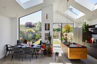
The picture window frames the dining space and, along with the sliding doors, provides an alternative to full-width glazing. ‘The corner of the extension opens up completely to the garden,’ Prue says. Glazing, . Skylights, . Three artworks, . Dining table, . Chairs,
(Image credit: Chris Snook © Future)
Project notes
The owner Prue de Wynter, an architectural and interior designer (pdarchitectureinteriors.com), her husband, Oner Ozenc, a production manager in men’s fashion, and their Bedlington terrier, Zeppelin.
The property A two-bed Edwardian terrace in north London.
Total project cost £106,500.
Starting from scratch
‘The house had been untouched for about 40 years,’ Prue says. ‘The couple who lived here before hadn’t done anything for a long time, but at some point they’d stripped back most of the beautiful Edwardian features, including the timber staircase and railings, and the original front door. The rooms were quite dark and there was nothing to maintain in terms of finishes, so we decided to strip it all back to the bare bones and start from scratch.
‘The rear had a small, run-down kitchen extension. The first thing we thought when we viewed the property was that there was potential to replace it with a modern extension. We could see that we could create the open-plan kitchen, dining and living space that we wanted from our new home.’
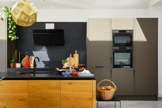
Kitchen and worktop, . Pendant light,
(Image credit: Chris Snook © Future)
Planning time
‘We didn’t move in straight away. It took three months to design the extension, then we submitted the plans to Barnet Borough Council in the December. We had approval in a couple of months after a bit of work on them. Originally, we wanted a full-width extension, but it ended up being more of an L-shaped design because we had to refine it a little in order to fit with the council’s requirements. We were on site by February, and the builders left in September – so it was a good 10 months of work altogether.
‘We had to start from scratch and find a contractor we liked, which was definitely the hardest part of the process. We did our research, but in the end, a colleague recommended someone and we went with them.’
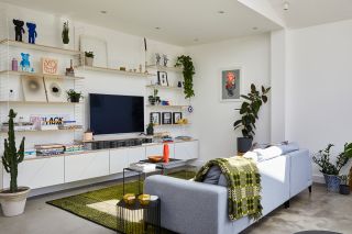
Sofa, . Nest of coffee tables, Side table, . Rug, . Artwork (to right of shelves),
(Image credit: Chris Snook © Future)
Design details
‘I wanted to maximise the internal height of the space, and my first thought was to design a pitched roof extension. I like the feeling of having a lot of space above our heads, so it feels a little like a warehouse conversion. We wanted a non-conventional space, which is hard to achieve with a typical London terraced home.
‘Our extension needed to stand out as something new, but we wanted it to complement the existing brick. There are grey tones in the houses on our street, so the blue-grey of the brick works well. The planners liked the fact that it contrasted and complemented. It’s notoriously tricky to try and match the brick of older buildings. Brick architecture is my passion – I love the handmade quality of the material.’
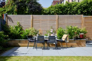
Sliding doors lead to the garden, which has been updated with modern wall planters, paving and a table and chair set perfect for entertaining guests. ‘We’re constantly between indoors and out,’ Prue says. ‘We love hosting barbecues.’ Table and chairs, . Paving,
(Image credit: Chris Snook © Future)
More from Real Homes
(Image credit: Future)
Love your daily dose of Real Homes? Then why not subscribe to our magazine? Packed with fabulous readers’ homes, trend features, project advice and easy updates, you’ll wonder how you ever lived without it.
Artful interiors
‘We like a contemporary base palette – think concrete, white walls, almost like a warehouse-style space. Having a stripped-back base acts as a blank canvas that we can add to. We use art to add colour and texture. We collect contemporary pieces, and our furniture and fittings are of a minimalist style.
‘I didn’t want a conventional-looking kitchen with lots of wall units and a splashback. I think our kitchen looks more like a piece of joinery than a normal, functional run of units. There’s no ironmongery or handles.
‘In fact, I was very keen to avoid chrome fittings in the house altogether. We love matt black, so we used that as much as we could in the space – for example, on the window frames and for the taps. It’s simplistic and unconventional.’
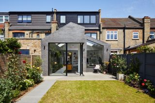
Prue opted for blue-grey bricks to contrast with, but still complement, the original Edwardian architecture. ‘It’s much more effective to go for a stand-out brick than to try and match the original,’ she says. Bricks,
(Image credit: Chris Snook © Future)
Family living
‘Part of the planning process was about deciding the layout of the space. It felt natural to have the dining space in front of the picture window, so you can sit in the window seat and eat. It’s quite a typical layout for an extension, with the living space further back where there’s a cosier atmosphere. Sliding doors were an essential, and we’re always running between indoors and out in summer.
‘We love the extension, though it took a while to get used to the size of it! You appreciate how light it is when you move into the older areas of the house. We’re having our first baby later this year and although we designed the extension with a young family in mind, I’m excited to see how we’ll all use the space together.’
- Sliding doors and windows:
- Rooflights:
- Kitchen:


