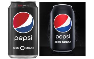
Pepsi has given the world some standout advertising moments, with starring roles from everyone from One Direction to Beyoncé. And the classic glossy can with its red and white logo has been centre-stage for all of them. But for this health-conscious era, Pepsi’s Zero Sugar has been redesigned and is now prepped to take the spotlight with a brand new can. (For more packaging design wins, see our pick of the best.)

Pepsi has ditched the glossy finish usually found on beverage cans, and replaced it with a sleek matte texture. A black rather than a silver tab sits on top of the can (you can glimpse this addition in the product advert below). The font is now bolder, there’s no circle in between the ‘zero’ and ‘sugar’, and the ‘max taste’ strapline has been removed from above the logo.
Pepsi-lovers in the US will be jumping for joy (perhaps literally, as Pepsi Zero Sugar contains double the caffeine of normal Pepsi) as they can find the new design on shelves near them, right now.
The new product design was released alongside a smart advertising campaign that promised US Superbowl fans a free Pepsi Zero Sugar if either team ended up with a score that ended in zero. The move should put the product in the minds of around 100 million viewers come 2 February – at a cost of about 250 million dollars to Pepsi, if everyone takes up the offer.
We should add a disclaimer that it’s only the US audience that will be able to sample the results of this rebrand. In the UK we are still enjoying Pepsi’s no sugar option as Pepsi MAX, which remains housed in its usual shiny black can.
According to Todd Kaplan, vice president of marketing at Pepsi, the brand is going “all in” on Pepsi Zero Sugar this year, which is no surprise given the revolt against high-sugar food and drink that seems to be increasing each year. “At Pepsi, we are always looking for new ways to meet the evolving preferences of our consumers, and we know that people increasingly are looking for sugar-free options,” says Kaplan.
“We’ve learned that once people discover the great taste of Pepsi Zero Sugar, they can’t get enough of it and keep going back for more,” he continues. “We… have created a bold, unapologetic new look to match its great taste, with a new matte black can and a black tab that will stand out anywhere.”
We’re not quite sure what an “unapologetic look” is, but we like the look of the the new can, which is super-minimalistic, and we bet it has a great hand-feel with the matte texture. Rebrands have been trending towards the minimalistic lately, and it’s also not the first time matte black has been embraced this year, with designers going wild for this UNO concept design. We wonder which brands will be next to scale things back.
Read more:


