It doesn’t matter how perfect your home is—if your listing photos don’t stand out, potential buyers won’t come by to take a look. In our series “Lessons From Listing Photos,” we dissect the smart updates sellers have made to their homes, and how their listing pictures highlight the home’s best assets.
The self-proclaimed slogan for St. Paul, MN, is “the most livable city in America,” but that doesn’t mean every house in the capital city is one you’d love to live in. This five-bedroom, four-bathroom home may be just miles from downtown, but it had definitely seen better days when it was purchased in 2018.
Thankfully the new owners were ready for a challenge. Out went the 1970s decor stamped in nearly every room, and in came a modern, relaxed style that brought buyers running. Within two years, the house was sold again, for $1,049,000—more than double the previous purchase price of $520,000.
So how did the home sellers make it happen? We tapped top interior design and home staging experts to find out not only what the sellers did exactly right, but also how you can use their advice to achieve the same success when selling your home.
Entryway
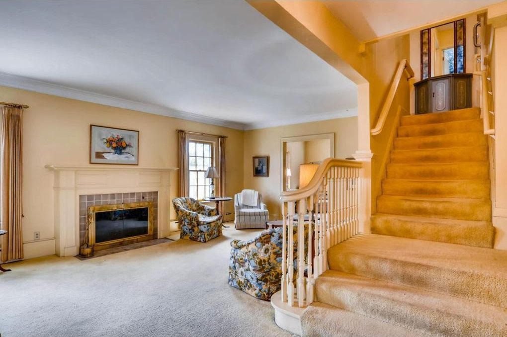
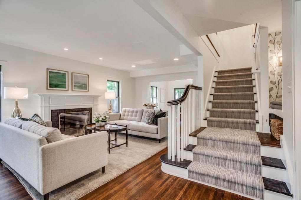
The entryway gives buyers a first impression of the house, and before the renovation, this space probably made more than one potential buyer turn right back around.
Designer and home stager Kim Gordon says the place even looked like it might have had a musty smell.
“The carpet up the stairs is dirty, and the drapes are wilted,” she notes. “Even with so little furniture, the space feels cramped.”
But the update managed to completely change the feel of the space, she says.
“The updated entry has utilized the magic of a white color palette and the contrast of rich woods on both the floors and the banister,” she says. “You’d never realize it’s the same fireplace.”
Gordon also notes that the updated staircase railing—which uses a darker stain on the original rail but new spindles—goes a long way toward modernizing the space. “Such a smart move,” she says.
The new space is now much more welcome to prospective homeowners, especially those looking for a place to entertain.
“To achieve an open floor plan, the back wall was widened and doors removed completely to allow for lots of space and an uninterrupted flow between the rooms in the home,” says Luciana Fragali, owner of high-end interior and architectural design firm Design Solutions.
Dining room
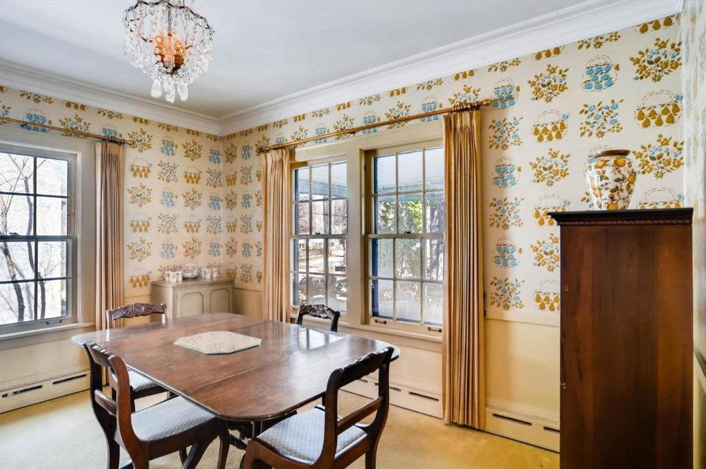
The original dining room could be described as dingy at best.
“Did Lincoln eat here?” asks Gordon. “The gravity of years has drained the room of joy, and it is past the point of charm.”
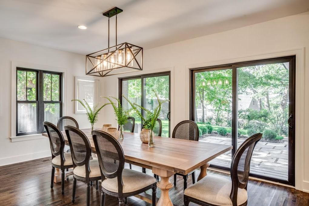
She was happy to see the changes to this space, saying a white theme with contrasting darker wood tones is the heroine again.
The brighter walls aren’t the biggest change in this room, though.
“A pair of new sliding glass doors bring the outdoors in,” says designer Russel Brightwell. “The black trim around the doors and windows creates a graphic frame to the outdoor views.”
According to Gordon, the addition of those doors was probably not as costly as many homeowners would imagine.
“When you have a window, the framing has created an opportunity for a door because there will be a header holding the room up,” she explains.
Kitchen
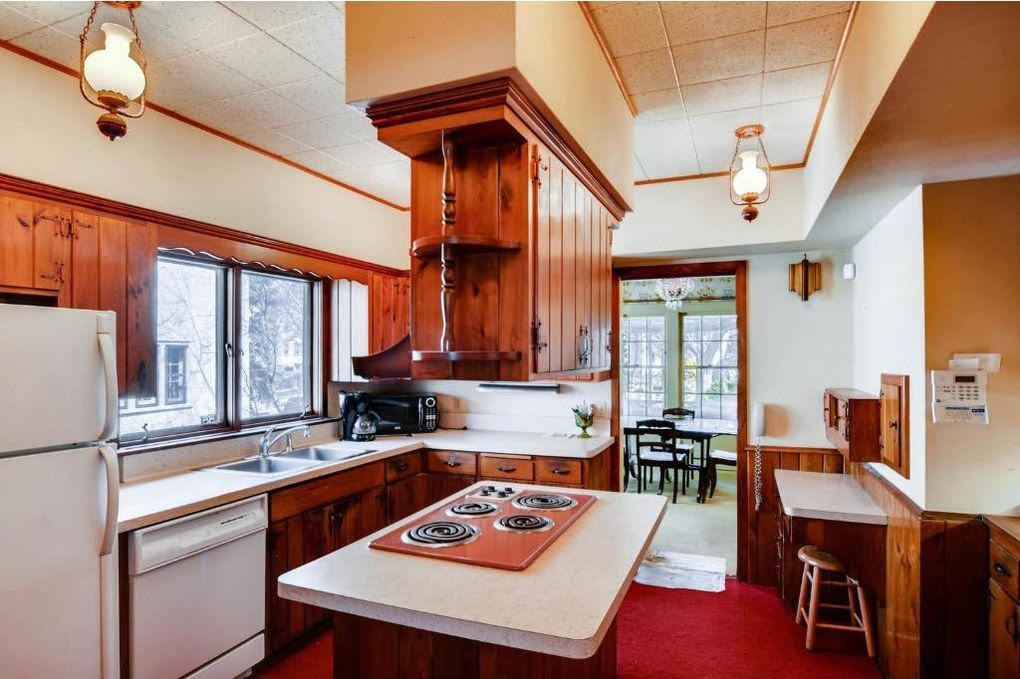
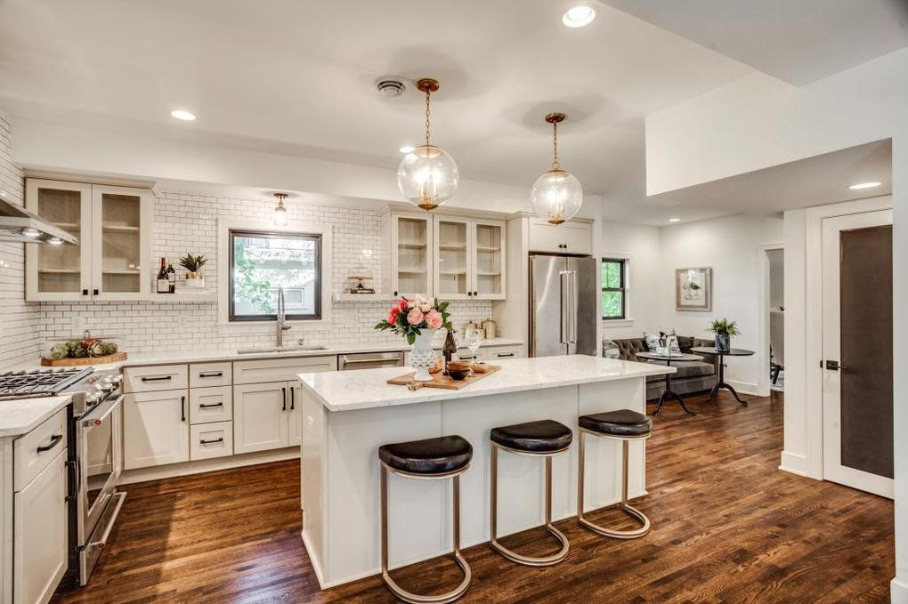
Four words: carpet in the kitchen. We’ll never understand why this was a trend in the ’70s. Even those who love a vintage style would have to admit this kitchen was just too much.
“The partial wall separating the dining space from the kitchen makes this space feel more cramped than it needs to be, while the red carpet on the floor makes it feel old and damp,” says Fragali. She and the rest of our experts were happy to see that little (if any) of the original space survived the renovation.
“The renovated kitchen looks much better thanks to the simple minimalist color scheme of white with hardwood floors,” Fragali adds.
But the new owners didn’t just change the color scheme; they also tore down walls.
Shruti Kulkarni, resident designer at NEDC, says that change was also for the better.
“The open kitchen layout is a great way to connect the space with the rest of the house, giving you ample space to move around.” she says.
Child’s bedroom
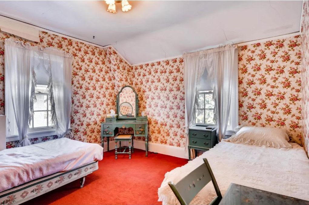
A bedroom is supposed to be a calming retreat, but there couldn’t have been much relaxing happening in this original bedroom. All that color is pretty much the opposite of relaxing.
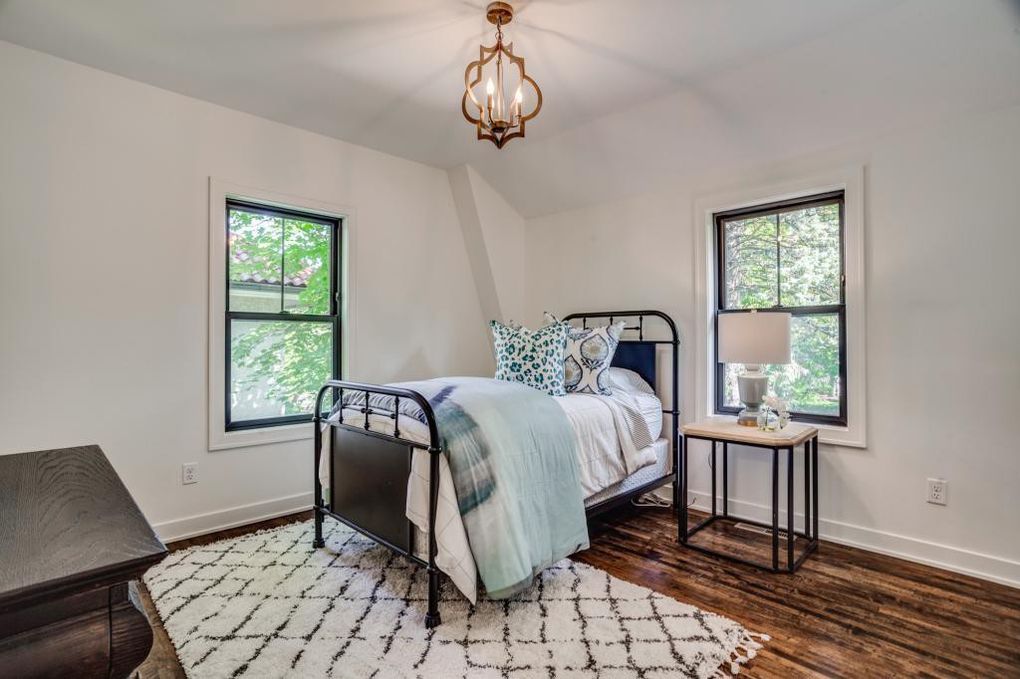
“This bedroom went from creepy to crisp with the same type of cosmetic upgrades that we saw in the other rooms—new floors, white paint with black accents, upgraded lighting, and removal of window coverings,” says Brightwell.
“The minimalism in design in this after photo has truly changed this room for the better,” Fragali says. “The change from carpet to hardwood floor also adds to the value of the home, as hardwood floors have long been the top choice for home buyers due to their elegance, durability, and low maintenance.”
Porch
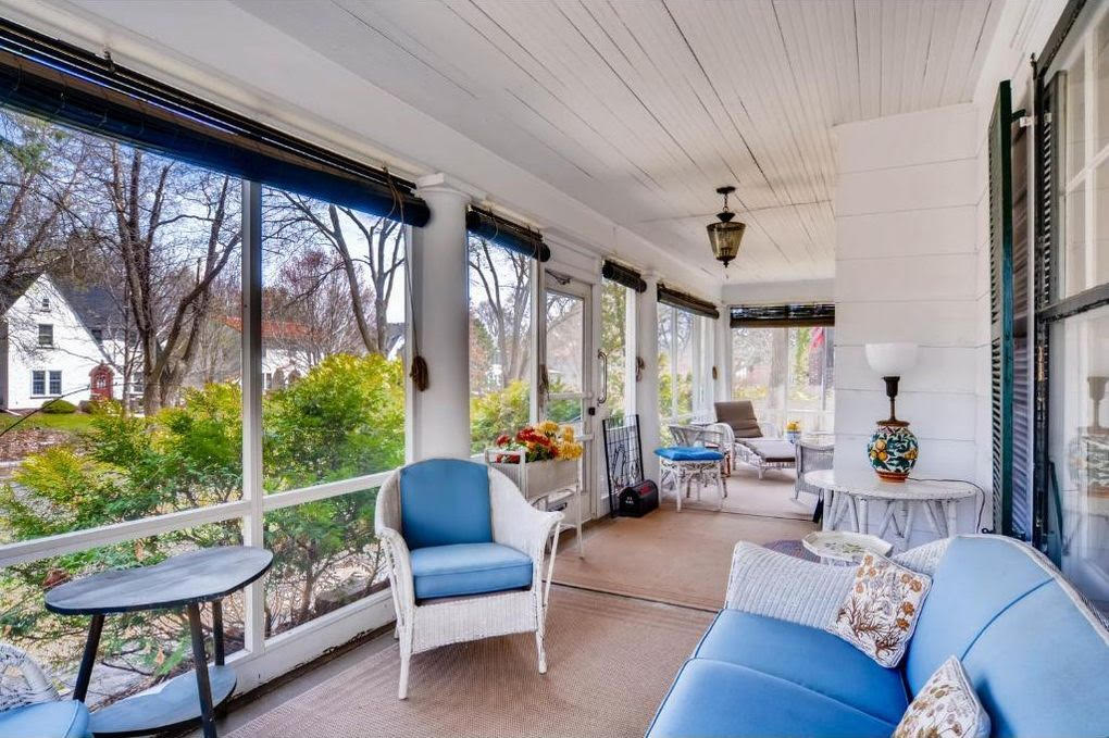
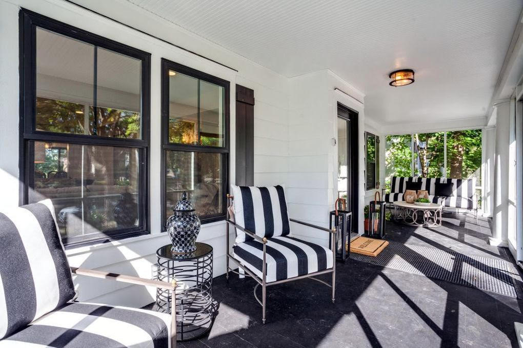
This big front porch could easily be the best selling point of this house. It basically adds another room, and sets the tone for the whole space—both for visitors and those passing by. The homeowners must have known that, because, according to the experts, they hit this renovation out of the park.
“I love how the modern-looking patio gives a glimpse of what the rest of the house has to offer designwise,” says Kulkarni. “The black-and-white elements look chic and are in sync with the current trend of minimalism.”
Gordon noticed a small change that she says makes a huge impact.
“Notice the ceiling boards. … The original house had them going longwise,” she says. “This is hard to pull off because the room is longer than the size boards are available, so the builder put the boards in the other direction. There are no seams, and it looks a lot cleaner.”
“The outdoor space is as contemporary, attractive, and usable as the indoor spaces,” adds Brightwell.


