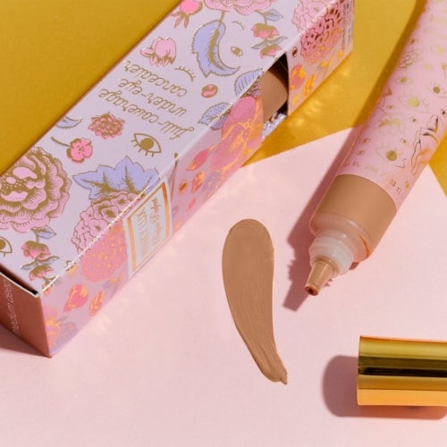
NEW YORK, United States — Back in 2015, when Natalie Mackey was developing her beauty start-up Winky Lux, branding experts urged her to adopt a minimalist aesthetic. After all, they argued, if sans-serif fonts, muted palettes and liberal use of white space had worked for Everlane, Outdoor Voices and Glossier, why rock the boat?
Mackey went in the opposite direction: Winky Lux’s “flower balm” lip stain comes in a magenta and metallic tube, with a chrysanthemum flower suspended inside the product itself. The brand also sells glitter, rainbow, and confetti lip balms for $16 a tube.
Her maximalist gamble paid off. The vibrant packaging made for excellent unboxing bait on YouTube, and glittery, glossy lips were easily identifiable as the product of Winky Lux balms when they popped up on Instagram. The company said it has seen triple-digit sales growth every year since the business launched, and it became profitable in early 2020.
“I know that people liked the minimalist stuff, but I felt strongly,” Mackey said. “Colour and brightness elicit an emotional reaction, like a five-year-old that gravitates to sparkles. And the more reaction we got, the more we leaned into it.”
Start-ups like Winky Lux are rebelling against the defining qualities of branding in the direct-to-consumer era, where product after product relies on the same “anti-marketing” marketing, meant to lull the consumer into a frictionless purchase. Sometimes referred to as the “Millennial” aesthetic, sleek fonts, pastel colours and other signifiers have been distilled into a single word by their detractors: blanding.

Winky Lux’s branding often uses ultra-feminine scriipt and glittery imagery to distinguish itself. | Photo: Courtesy
The term was coined in 2018 by Thierry Brunfaut, creative director at the firm Base Design, who also dubbed it “the worst branding trend … you probably never noticed.” It has since come to encompass practically every aspect of DTC brands’ start-up culture, from their logos to their founders’ cookie-cutter origin stories to their recycled packaging. In September 2020, Bloomberg Opinion writer Ben Schott expanded upon the term, holding a mirror up to a wave of start-up consumer products he called “blands.”
“What makes a brand a bland is duality: claiming simultaneously to be unique in product, groundbreaking in purpose, and singular in delivery, while slavishly obeying an identikit formula of business model, look and feel, and tone of voice,” Schott wrote. He told BoF in an interview that brands operate on a blanding spectrum, where some behaviours are more blandish than others, and no brand is entirely bland or unbland.
There is a reason brands willingly become blands: it works. Or it used to. Today’s shopping landscape is crowded with brands old and new, and when all of them adopt the same look, none of them stands out. Even luxury fashion brands like Saint Laurent and Burberry have swapped storied logos for minimalist ones, and consumer product giants are mimicking the branding of their DTC disruptors.
“I thought about doing blanding ads as a parody because it’s become so ubiquitous that it’s meaningless,” said Jack Carlson, founder of the fashion brand Rowing Blazers, which specialises in preppy staples — striped rugby shirts and patchwork golf shorts — with a sprinkling of streetwear flair. “There’s something kind of humorous about seeing the same branding over and over again. It’s like going to the suburbs and seeing the same houses next to each other,” Carlson said.
Carlson didn’t go ahead with the parody ads because he was worried not enough people would get it. (Schott, for his part, said Rowing Blazers’ defining feature as a non-bland is its penchant for irony: “Blands…don’t express a sense of irony and the reason is that irony is exclusive, and it’s excluding, by definition, you either get it or you don’t. Brands have a sense of humour and a sense of ludic playfulness, but they didn’t really do irony.”)
However, calls to retire blanding touchpoints are growing, especially as the direct-to-consumer boom has started to come up against new challenges, including a dearth of successful exits and the constantly rising cost of influencer marketing and Instagram ads.
But setting aside the blanding playbook means finding something else to replace it, or even rethinking how and where brands talk to their customers. Building a brand around a memorable product, rather than a logo, is a good start, said Nik Sharma, founder of marketing and brand consulting agency Sharma Brands
“If you look at a lot of the brands that do well, long term … they’re the ones that built that foundation [that] allows them to … really focus on identifying who their customers are, where they are, and what it takes for somebody to buy the product without being forced to buy it with an ad,” he said.
Leaving Blanding Behind
Elizabeth Goodspeed, an independent designer who’s worked for studios like Ro and Co and Pentagram, said it’s common for start-ups to approach her with mood boards that include looks from other DTC companies.
“They want to look like Glossier, but for cookware, or feel like Warby Parker, but for shoes,” she said. “People just want to iterate on that success.”
Goodspeed said she’s now suggesting clients go in a different direction, including ditching the mood board. For example, when working with the food container and bag startup Inka, Goodspeed encouraged the brand to consider references not from fashion or homeware, but from restaurants, fine art and architecture.
Everyone is set on being the coolest, but I don’t know if there’s room for that.
Brands face pressure to conform, however. Kim Burrs, president at venture capital firm New Theory Ventures, lays some of the blame for lookalike branding on “flat lays,” where influencers post images of neatly arranged products that adhere to a similar – often muted – colour scheme. Brands hoping to get that boost know they have to design packaging in the right mould.
What these brands didn’t realise is that from the start, they were gaining access to one group of customers – wealthy Millennials in big cities – but effectively writing off a much larger market, said Web Smith, founder of marketing and media company 2PM.
The look and feel of these brands are enticing to those urban Millennials, but can also feel off-putting to customers in the rest of the country, said Winky Lux’s Mackey. She said her brand’s look was partially inspired by the eccentricities of her hometown of Savannah, Georgia.
“Everyone is set on being the coolest, but I don’t know if there’s room for that,” she said. “And we actually see higher loyalty profiles from shoppers in the middle of the country.”
Carlson, of Rowing Blazers, said going in a different direction from the rest of the DTC pack carries its own challenges. (The brand’s public moodboard — where images of Sesame Street’s Big Bird live next to the late rapper Notorious B.I.G. — offers a glimpse into the brand’s ethos.)
“It’s definitely less digestible than the minimalist aesthetic and takes time to absorb, but we think it’s stickier,” he said.
A New Branding Blueprint
Smith sees blanding as the product of a “DTC industrial complex” of companies “founded by a well-connected New Yorker or Los Angeles [resident] that raises money relatively easily and has easy access to branding.”
More recently, a more diverse group of founders have launched brands that pull from a different set of references. Sterile minimalism is just one more thing to rebel against.
In the beauty world, many makeup and skin-care brands now promote themselves as designed for people of different skin tones, pushing back against an industry that has catered mainly to the needs of white consumers.
Olamide Olowe and Claudia Teng, co-founders of the skin-care brand Topicals, emphasise that their products are tested to ensure safe use on all skin tones, citing a history of medical dermatology overlooking Black skin-care needs. The brand also insists on “skin neutrality,” meaning they don’t publish only images of models with “clear” skin on their Instagram page.
View this post on Instagram
A post shared by TOPICALS (@mytopicals) on
“On Instagram, everyone has perfectly airbrushed skin, and you want your grid to look really … put together,” Teng said. “We wanted to use our Instagram as a place to bring more representation to people who had different skin types.”
Parade, a start-up that sells brightly coloured underwear made from recycled fabric, has a logo that stands out: the brand name is illustrated in bubble-like, all-caps letters inside a blimp-shaped border. The start-up handles branding in house; co-founder Cami Tellez designed the logo’s first iteration herself.
“I think it was critical for Parade to come from a 23-year-old, first-generation … Latina [whose parents are] immigrants,” said Tellez, whose parents are from Colombia.
In addition to the underwear, the brand’s signature rainbow logo hoodie and print scarf, two items frequently gifted to influencers and editors, are fixtures on Instagram.
“Parade’s world really goes back to our core belief that women and femme-identifying people are dynamic, creative and expressive people,” Tellez said. “That really means that we’re building a full spectrum, full-bleed, colourful and expressive world, which is very different than what a lot of the [digital native vertical brands] of the past have set out to do.”
Imagining a Post-Bland World
Goodspeed said a few design trends are starting to make inroads against minimalism.
An aesthetic she called “Y2K style” retains aspects of the muted branding of the past decade, but also uses bold design tweaks like bubble letters and cold colour palettes, such as bright yellow and lilac. Adherents include Starface, an acne sticker company and EvenPrime, a vegan K-Beauty-inspired skin-care brand.
Topicals consulted with London-based branding agency The Digital Fairy, which specialises in the aesthetic, and their product packaging is a grab bag of graphic design goodies: bubble and cursive lettering reminiscent of the Powerpuff Girls logo of the early aughts. Goodspeed said Y2K style is popular on TikTok and Depop (Depop’s chunky logo is itself a prime example) and is popular with Gen Z.
A 1970s feel is also becoming more common, including a warmer colour palette and heavily-serifed fonts like Cooper Black and Bookman Swash. Brands like cookware company Great Jones rely on the aesthetic and often use a less dense variation of those fonts to give them a contemporary feel.
Goodspeed said minimalism still has its uses, however.
“A brand is a kit of parts you supply people with — a logo, a type treatment, a colour palette, a set of illustrations — and those get sort of reshuffled all the time for different applications,” she said. “It’s impossible to make a brand ultra-complex unless it’s a very small brand with a really limited application.”
Thinking Beyond the Brand
Smith, of 2PM, said companies need to focus on creating standout products rather than on their branding, especially now that giant corporations are creating sub-brands that look exactly like their DTC competitors.
Target’s in-house lingerie brand Auden, for one, uses the slogan “more sizes for more bodies,” a sentiment that would be equally at home on the website of any number of DTC competitors.
“These incumbents look just as good … and make it just as easy for me to buy from them,” Smith said. “A lot of these cookie-cutter companies that don’t have the fundamentals correct have a harder time scaling against traditional brands. It needs to be about loyalty to the product.”
Carlson of Rowing Blazers, said that by not sticking to the DTC rules, his company can be more flexible — collaborating with brands ranging from Lands’ End to Fila to New York dim sum restaurant Nom Wah Tea Parlor. Sales have tripled year over year, he said.
“It’s actually not because ‘oh we’re just a blank canvas that can do a collaboration with anybody,’” Carlson said. “It’s actually totally to the contrary: We have such a strong brand that we’re able to do those partnerships that are high and low, traditional and much more avant-garde, and our brand remains strong and intact because the brand is so strong in the first place.”
Related Articles:


