There are so few ways to express yourself when you’re Goldman Sachs. Sure, you can commission a 10-part documentary series about your company’s history, and your chief executive can moonlight as a D.J. in the Hamptons. But how do you let the masses know what it’s like to really be you, the bank, in your everyday functions, processing financial spreadsheets and taking companies public?
You design your own font.
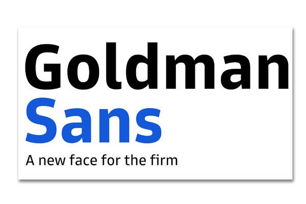
In early June, Goldman Sachs introduced Goldman Sans, a typeface it describes as “approachable without being whimsical” and “neutral, with a wink.” It’s free for anyone to download, and it would appear to be part of a continuing effort by the bank to seem more digital and open: In recent years, Goldman has relaxed its dress code, collaborated with Apple on a credit card and opened an online consumer bank called Marcus. (Technically, Goldman Sans is a typeface, while its component forms — Goldman Sans italic, for example — constitute fonts. But many people use the terms interchangeably.)
Bespoke typefaces are an increasingly common corporate flex. Other companies that have recently commissioned them include Toyota, Duolingo, Southwest Airlines and CNN. Google has created several, from the minimalist Open Sans, to the playful YouTube Sans, to the ever-so asymmetric Scope One. Goldman intends to phase the font into its branding and marketing needs across its website, apps and even YouTube videos.
“Corporate fonts provide a consumer’s first impression,” said Sarah Hyndman, the author of “Why Fonts Matter” and the owner of Type Tasting, which offers multisensory font workshops. ““It sets a tone. It creates trust. It’s a flavor.”
To create its typeface, Goldman hired Dalton Maag, a stately 29-year-old British design firm that crafted Bookerly, used on Amazon’s Kindle e-readers, and the BBC’s BBC Reith, which is distinctly British, with subtle hints of calligraphy. Goldman’s brief was clear: The bank wanted something that was so legible you could read strings of numbers on a phone screen or a smartwatch but that would still look good on 50-foot billboards.
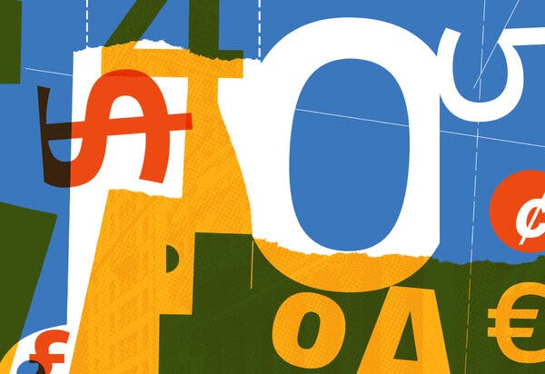
To accomplish this, each character of Goldman Sans is sculpted to be identifiable at a glance. The tops of p, q, n and g all taper into what marketing materials call “slight chamfered spurs” to create more white space. The i and j, hard to differentiate in some fonts, feature unique crowns. The x-height (that is, the height of a lowercase x) is noticeably tall — more than three-quarters of the height of a capital letter. The interior shapes of rounded forms — o, b, d — differ from the external shapes to make them distinct.
Perhaps most challengingly, Goldman Sachs wanted all numbers, from a skinny 1 to an obese 8, to line up perfectly in a financial table. Users can even apply italic, bold or light styling to letters and numbers without changing their alignment on spreadsheets. Some type obsessives were impressed. In Reddit’s main fonts forum, r/fonts, a user named “me3peeoh” called the feature “a gamechanger.”
Goldman Sans had to be more than just practical. It had to have just the right amount of personality. “The design challenge was to make something distinctive enough to be worthy of existing without being so quirky that it got annoying over time,” said Andrew Williams, Goldman’s director of communications. The typeface gets funky in characters less likely to show up on a spreadsheet: The & and @ characters are almost obscenely curvy, and an alternate lowercase g is a wacky, double-story affair.
This dual life is a lot to ask from a font: distinctive enough to please aesthetes, neutral enough to include the paperwork for an initial public offering.
“What I’m lacking is any connective tissue to Goldman Sachs as a company,” said Mike Abbink, a font designer. “I’m finding very little formal relationships to a historical point of view. It’s focused more on functional requirements, so it’s missing life to me.”
Mr. Abbink created IBM Plex for the Armonk, N.Y., tech giant in 2017 — a typeface that conveys the melding of man with machine by combining the industrial revolution vibes of Franklin Gothic, the softness of Gill Sans and the perfection of Helvetica Neue. Other corporate fonts try to include nods to heritage and branding, however esoteric: The curve of Netflix Sans’s t pays homage to CinemaScope, for example, and the angles of YouTube Sans’s capital letters are meant to echo the platform’s classic play button.
By the standards of banking, Goldman Sans feels slightly casual. Maybe that’s intentional: a font that would be careful with your money, but not so careful that you didn’t beat the market. It’s a sans serif, forgoing the flourishes found at the ends of letters in typefaces like Imperial, the stately font of this newspaper.
“Goldman Sans is a typeface that does not wear a tie. It’s a casual Friday,” said an unimpressed Erik Spiekermann, the first typeface designer to be elected into the European Design Awards Hall of Fame. (There’s some history between Mr. Spiekermann and Goldman’s design firm: Dalton Maag was hired to replace the font he created for Nokia.)
Mr. Spiekermann said he considered Goldman Sans well constructed, but — like many corporate fonts — boring and derivative.
As does Sumner Stone. He is a designer of over 180 typefaces, the author of “On Stone: The Art and Use of Typography on the Personal Computer,” and a person who, in the late 1960s, moved to Kansas City for a job at Hallmark just to work under the fontsmith Herman Zapf. “Dalton Maag’s business has been primarily the kind of work that we see with Goldman Sachs,” Mr. Stone said. “They make very safe typefaces for big corporations who want something typical.”
John Hudson, who has designed typefaces for Microsoft, IBM and Apple, is another critic. In response to an open call for opinions about Goldman Sans on TypeDrawers, an online discussion forum, he wrote: “The design represents what is becoming the norm for corporate custom typeface development: lack of courage and imagination, and increasing desperation on the part of type designers trying to figure out ways to minimally differentiate the design from the ones they created for other clients with the same lack of courage and imagination.”
Many corporations make their custom fonts free to download, partly to allow international users who do work for the company to modify the character set, adding the characters they need for foreign alphabets.
When Goldman released Goldman Sans on June 2, it followed suit. But a link below the download button sent users to something called the “Goldman Sachs Restricted Font License.” Buried within the legal document was Article C, Section 2, subsection d, which stated: “the user may not use the licensed font software to disparage or suggest any affiliation with or endorsement by Goldman Sachs.”
Within a few weeks, a poster at Hacker News noticed the nondisparagement clause. Soon, all over the web, all kinds of people — bank haters, typography geeks, First Amendment stalwarts — were writing mean things about Goldman Sachs in its own font. Many went with the obvious “Goldman Sucks,” which looks almost authoritative in Goldman Sans. Others dug up Matt Taibbi’s memorable description of the bank in a 2010 Rolling Stone article: “a great vampire squid wrapped around the face of humanity, relentlessly jamming its blood funnel into anything that smells like money.”
The line doesn’t seem nearly as bad in Goldman Sans, which has a certain neutering effect. When the phrase “Goldman Sachs performs human sacrifice every Wednesday” is rendered in Goldman Sans, it seems like something you might see posted on a sign in the bank’s cafeteria.
Josh Bernoff, the author of six business books, wrote “Goldman Sachs eats babies” on his blog. Then, he recalled in an interview, he thought better of it and quickly added: “Obviously, Goldman Sachs does not eat babies.”
“I thought that was the most dramatic possible way to demonstrate that telling people what they can and can’t do with a font is a pretty silly way for a company to behave,” he said.
Dana Justus, a trademark lawyer at the Washington, D.C., firm Sterne Kessler, said in an interview that Goldman’s terms might not be valid because the link could be considered hard to find. “It’s below the download button in small text,” she said. “You don’t need to affirmatively click or check a box — things consumers are more used to. Is this an enforceable software license? Some courts would say no.”
David Nimmer, a U.C.L.A. professor and a lawyer who has argued copyright issues before the Supreme Court, said he didn’t think Goldman would ever try to enforce the disparagement clause. (Mr. Nimmer’s father created the definitive multivolume legal treatise “Nimmer on Copyright,” and Mr. Nimmer wrote a revised version.) He’s been disappointed by court decisions favoring contracts over free speech lately, though none have allowed anything like this. “This would be like an author saying anyone can quote from her book, unless it’s in a negative review. There’s no court that I know that has applied a strictly anti-First Amendment view squelching criticism based on copyright law. And I hope they would draw a line in the sand.”
On July 17, Goldman quietly removed Article C, Section 2, subsection d, changing its download terms to the industry standard SIL Open Font License. Everyone can now use Goldman Sans to mock Goldman. Although if you want people to truly notice, you might want to pick a different font.