If you’re the type of person who can name 20 different shades of white paint and how you should use them in your home, then you’ll be thrilled to learn Sherwin-Williams has launched its Emerald Designer Edition. The collection of 200 colors includes earth-drawn neutrals that go beyond your basic natural tones. “We’ve been so gray and white for so long that there’s a shift in the design world that’s going towards more of these natural neutrals,” says Sue Wadden, director of color marketing at Sherwin- Williams. Country Tweed, on the walls of this home office, may not be the most common neutral but it fits perfectly in the space to give it a minimal feel. “This color is just reminiscent of vintage and nostalgia,” says Wadden. “When I look at it, I think of the Scottish Highlands since it’s just so rich and natural.”
Sherwin-Williams created its Emerald Designer Edition after getting feedback from interior designers who were looking for more neutral options. This diverse medley of colors — think muted tones, must-have naturals and earthy greens — also has a smoother finish and better durability, making it easier to find the perfect shade. “Designers appreciate a little bit more nuance in their colors,” says Sue Wadden, director of color marketing at Sherwin-Williams. “So we had to fill some gaps. We needed a couple more neutrals, some blues and greens and some brighter pastel hues.” Here are a few highlights from the collection.

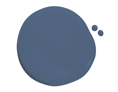
Azure Tide: Give your room a real splash of color with this ocean-inspired hue that adds vibrancy as well as a sense of calm to a bedroom or living area. “It’s got a little red undertone,” says Wadden. “And I think what we’re seeing from a trend perspective is that everyone is tired of neutrals. We’re ready to jump in and start getting excited about color and this in a bedroom would be beautiful, since blues are always soothing.”

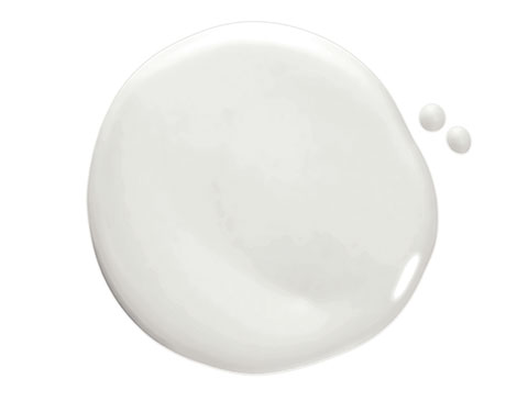
Gypsum: A muted creamy white, this shade is part of the ultra-white collection that is perfect for those still living that minimalist life. The brightness of this shade reflects well in a room with lots of natural light and the name is even inspired by a local fun fact. “Gypsum actually has Cleveland roots,” Wadden says. “Gypsum is a powder that you grind from limestone at the Erie islands by Marblehead and on Kelleys Island.”

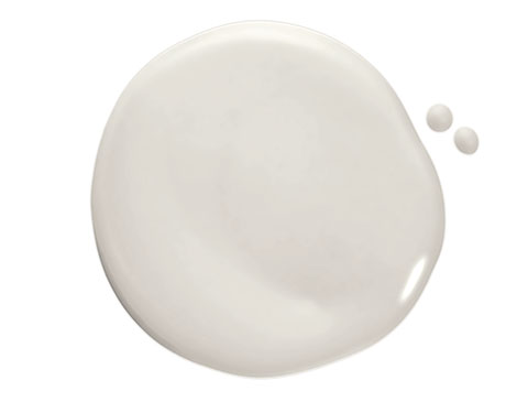
Sanctuary Wrap yourself in a lush white that feels clean and fresh. This isn’t completely blinding because of the slight tint of gray to it, so it gives your room a true feeling of escape. “This color just has like a little touch of gray in it which makes it more soft and beautiful,” says Wadden. “It’s tying into that style of minimalism that we all still love, while still being very light as well.”

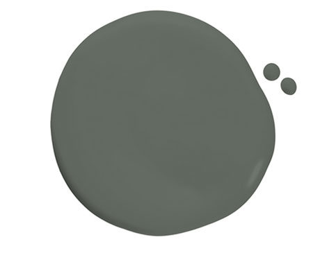
Succulent: Just like the dependable plant it’s named after, this dusty green color is an easy pick for your home. Pulling from the natural gray shade of a succulent leaf, this color works perfectly for highlighting trims or adding an earthy pop of color to any room. “We’re starting to see greens everywhere, and particularly in kitchens and cabinets,” Wadden says. “But what’s different about this one is it’s got gray undertones to it, so it looks really muted and sophisticated.”
Name Game: An inside look at how Sherwin-Williams comes up with the names for its paint colors.
What’s in a name? Well, for paint colors, they need to ignite a feeling. Sue Wadden, director of color marketing at Sherwin- Williams, says naming shades is important because it gives homeowners the first impression of what the color can do for their space. A process that includes up to three months of research by Wadden and then narrowing down the selections with her team ensures that each moniker represents the color perfectly.
After confirming that the name doesn’t already exist in their database of around 35,000 different options, the colors are tested by the marketing team and then sent to the lab. For the Emerald Designer Edition, Wadden notes that many of the names mimick a specific feeling or were inspired by Cleveland, such as Guardians, Prospect or Viaduct.
Sherwin-Williams employees even got a chance to name five of the colors, sending in more than 8,000 submissions. One winner? The breakfast-inspired shade, Sunny Side Up.
“I find the most successful color names are named for things that people recognize,” Wadden says. “Maybe there’s like a clever spin to them or there’s a little extended meaning behind it.”
Ultimately, if a story can be told, it can leave a great impact, such as the green, earth-inspired shade, Taiga. “It’s actually named after a forest in North America and it refers to these evergreen forests that are above the tree line,” Wadden says. “I actually used it in my dining room because it’s so gorgeous.”


