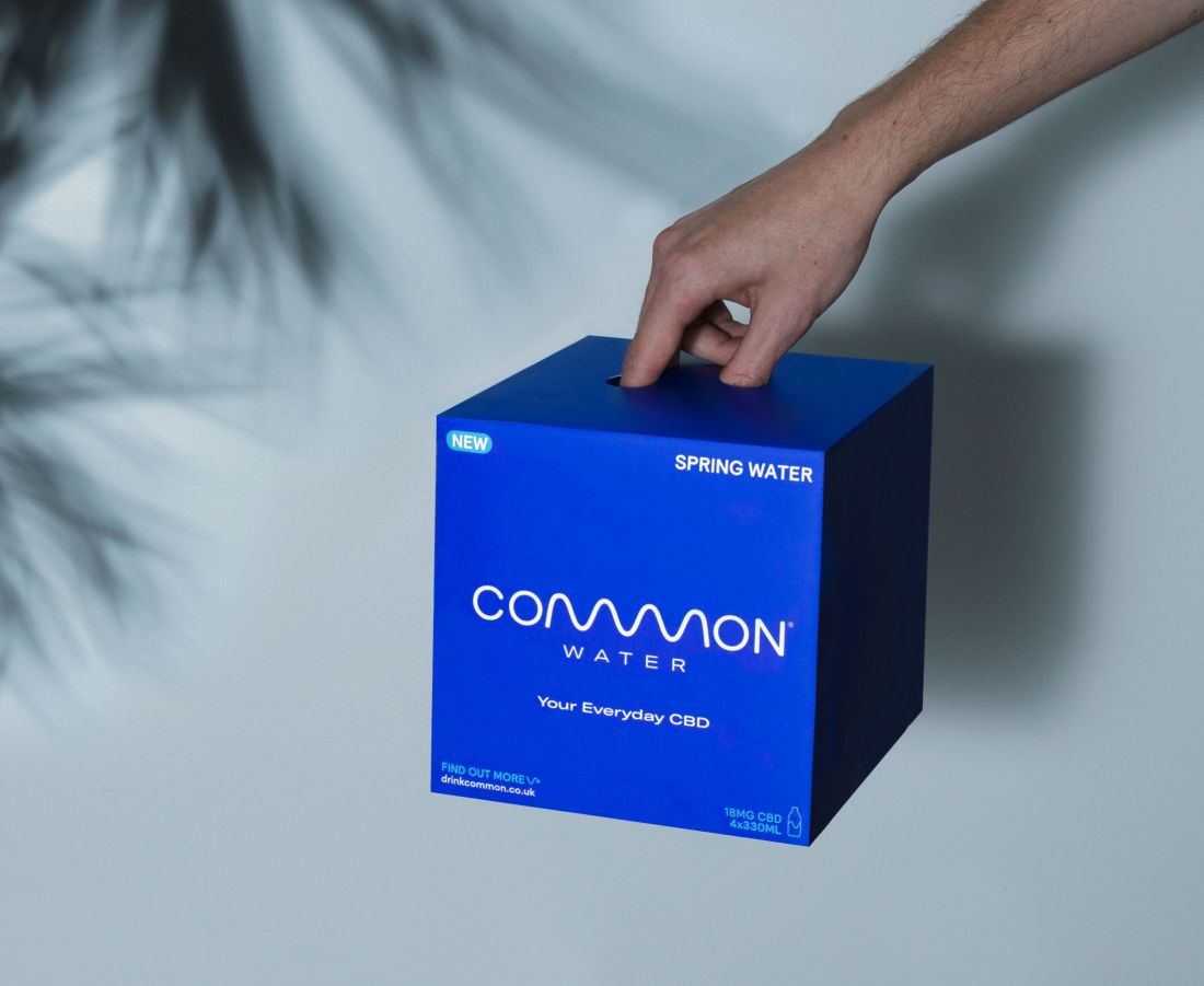
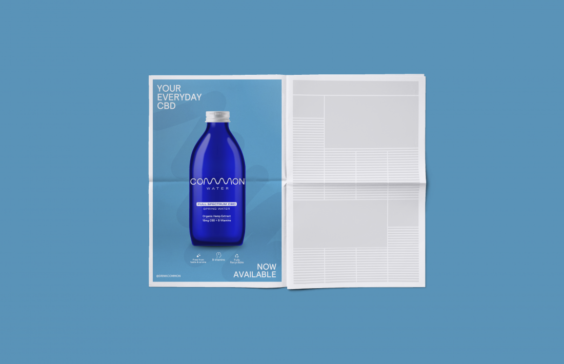
There’s been no shortage of pretty lovely branding for a new wave of CBD (cannabinoid) products lately, and the most recent to catch our eye is this identity for Common Water by The Clerkenwell Brothers
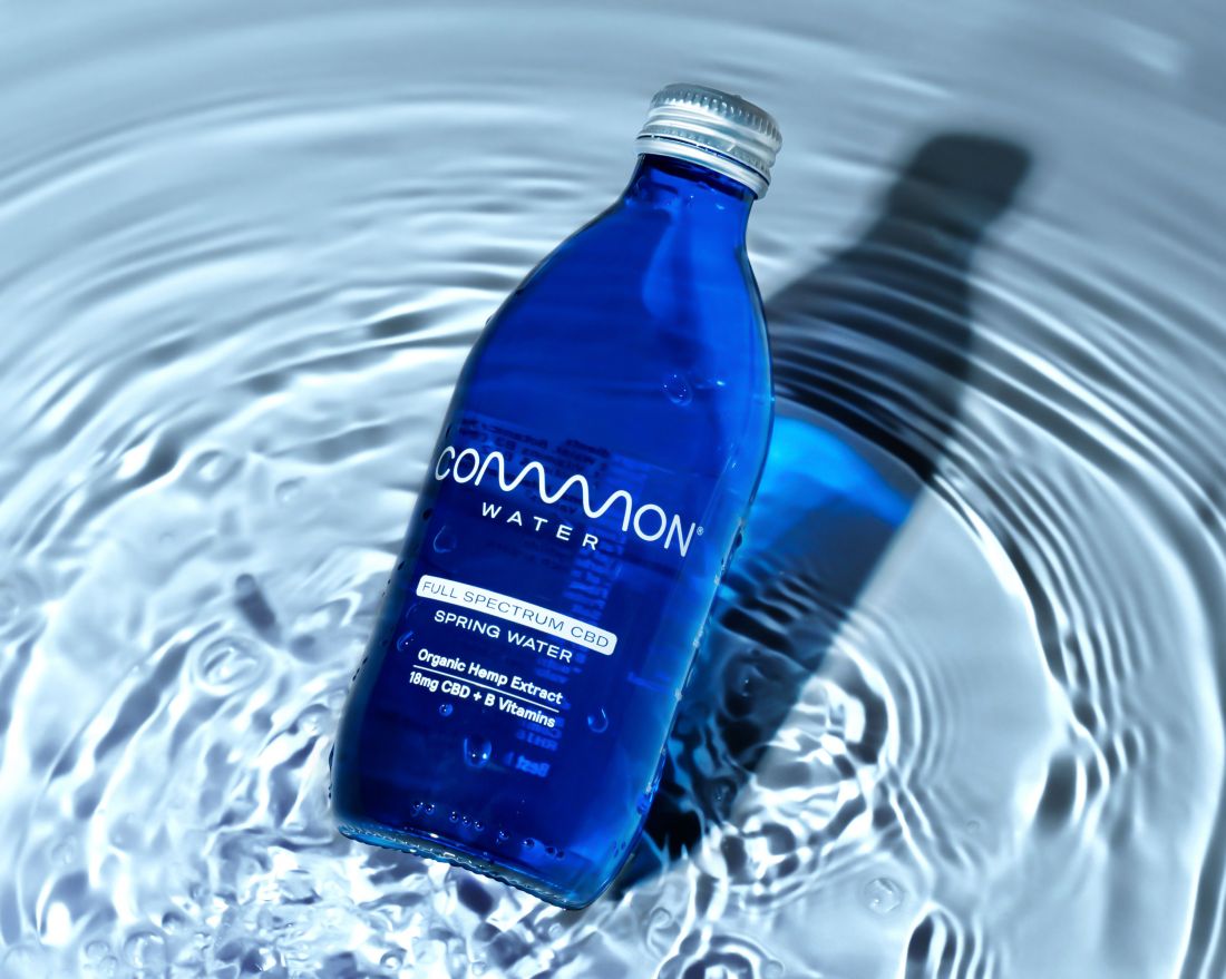
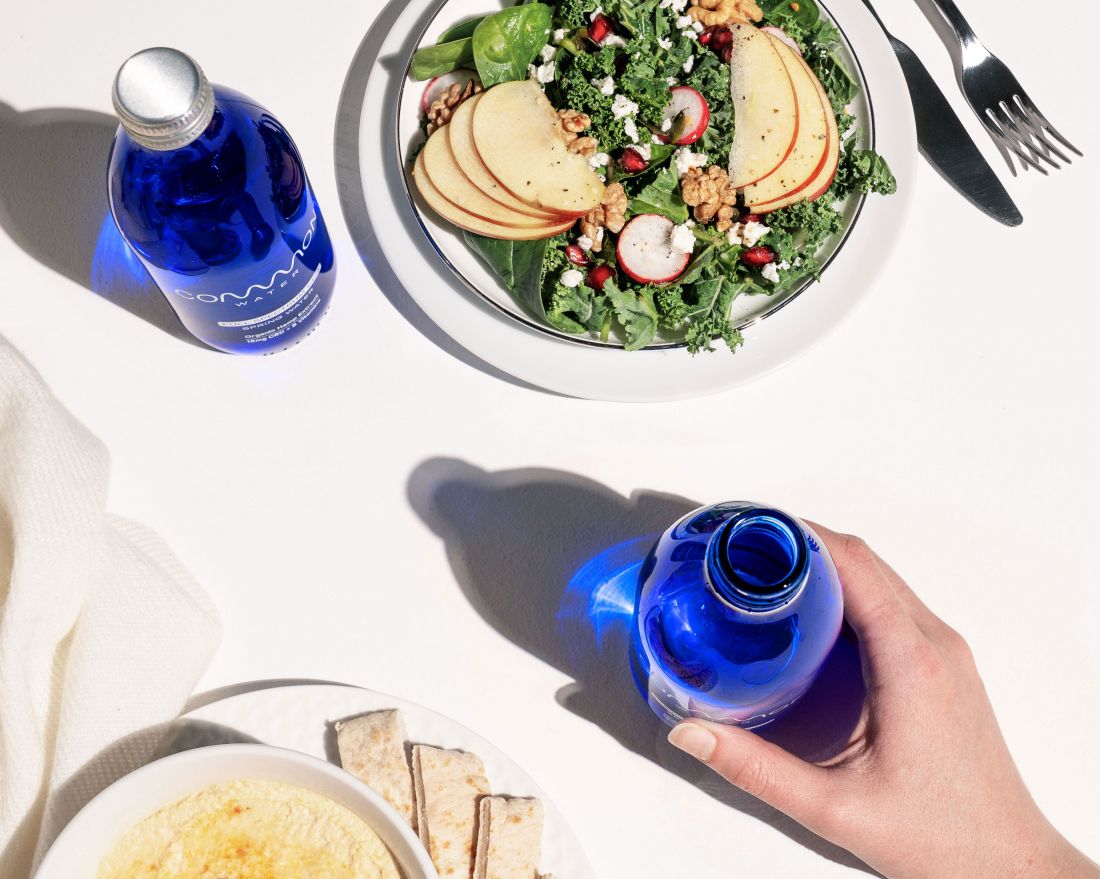
Common Water aims to provide a simple and effective method of consuming CBD using Derbyshire fresh spring water mixed with a patented water-soluble hemp extract and B Vitamins and no added sugars or flavours.
London design agency The Clerkenwell Brothers says it wanted to create “an iconic brand that positioned itself as a premium, grown-up alternative to existing CBD beverage brands in the market,” and shun cliched hemp or weed visuals.
Instead, the branding looks to hone in on Common Water’s “calming and functional benefits”, leading back to the brand’s “room to breathe” ethos and “position the brand and product as better for people and the planet”.
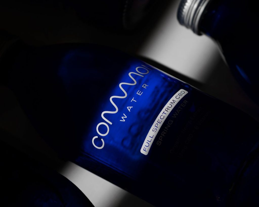
Sustainability is at the heart of the brand, which is packaged in fully recyclable blue glass bottles that also provide UV-protection for the CBD. “A single colour ink was used, sprayed directly onto the bottle to avoid the need for any plastic wrapping,” says The Clerkenwell Brothers. “Finally, the wider brand materials are all created with sustainable materials to ensure this is one of the lowest impact CBD brands on the market.”
The minimal, refined branding looks to reflect this calming ethos and provide a visual representation of the product as “an antithesis to the hectic nature of modern life” and a “no-nonsense, adult CBD product”, as the agency puts it.
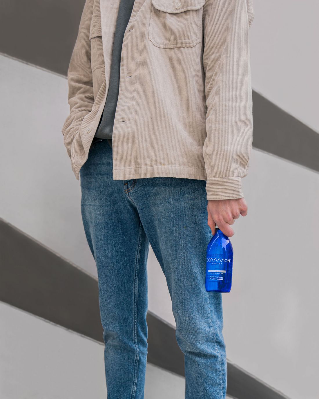
Faraz Aghaei, creative director at the Clerkenwell Brothers, says the studio was “conscious of the premium price point and target demographic of this product”, so set out to create a brand and packaging that “balanced being recognisable on shelf with being discreet in hand. The name and nature of the product provided us with an opportunity to develop a logo mark that encapsulated the entire brand.”

