Part of being a great content marketer is keeping an eye on what other content marketers are doing – to predict the future one starts with what has gone before.
I’m a genuinely curious person and fortunately, a big part of what I do involves researching and consuming a lot of content.
When I’m doing concept work, I usually start by reviewing back through my files of saved content, campaigns, and ideas.
If you don’t have a commonplace book then start now because it will be the best resource you have for ideas and creating content (I operate a digital version using Pocket, Instapaper, and Evernote).
Inspiration can be found everywhere.
A good idea will inspire you, whatever the medium.
Instead of sharing the usual suspects of content that everyone else seems to share, I’m going to show you a few random examples of creative ideas (and some old ones) that will hopefully inspire you to create better content.
Advertisement
Continue Reading Below
“If you only read the books that everyone else is reading, you can only think what everyone else is thinking.” – Haruki Murakami
1. Google
I know I said I was going to share random examples, but I had to start here because Google does produce some of the best content on the web.
Well, they would, wouldn’t they?
I mean, all that money.
Being a minimalist is difficult because the more elements you remove from a page, the more the remaining ones have to justify their existence.
I’m a huge fan of clean design – I like to see a strong concept elegantly executed.
And, Google is the master of elegant clean design.
How Search Works
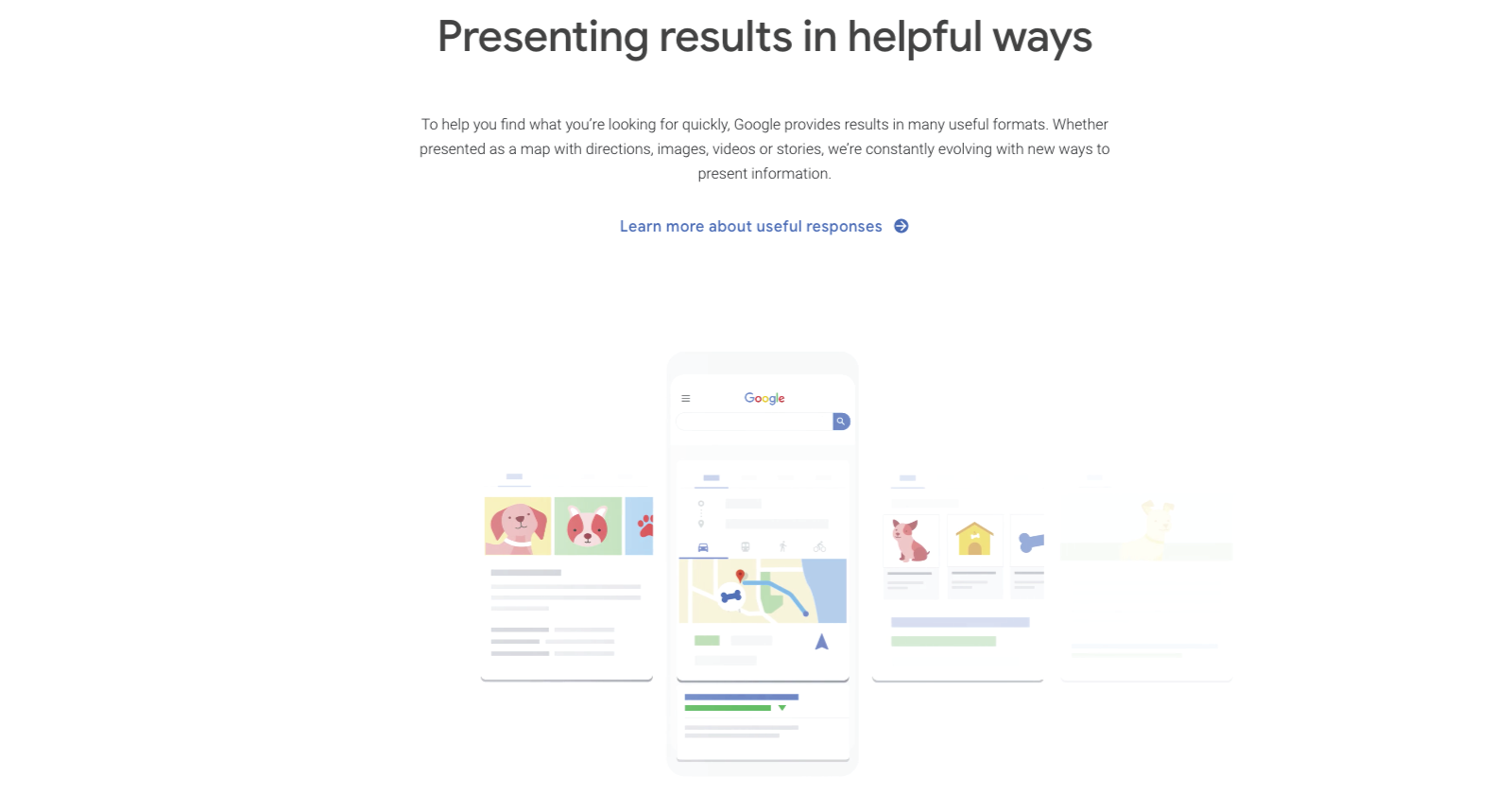

Sadly, the original piece of content on this page has changed.
The animated infographic that used to be here inspired me to push my coders to create the best interactive work we could.
Advertisement
Continue Reading Below
And I can tell you that is hard.
The existing page still is a perfect example of how to present a body of information so that the eye focuses on the content.
Animated graphics in the unmistakable Big G style add interest to the page, generating a rich visual experience to keep the eye engaged.
Google is also master at online typography – delivering the content with such impeccable spacing and balance of white that makes it easy to read.
As someone who studied classic typography, unless you have tried to do this, you won’t appreciate just how hard it is to do.
Phishing Quiz


An interactive quiz that walks you through how to avoid being scammed by phishing. Again, elegant design that highlights the key information and is intuitive to use.
Too many interactive pages are confusing or rely on over-design to compensate for a weak concept and low-quality research – I see this all the time.
The concept and quality of content are still paramount and the technical structure of the content is essential to get a user to the page.
But stage two of content marketing is to engage the user so they want to keep coming back. And this is where a great presentation will help to build your brand and build a relationship.
Google inspires a better presentation of content.
2. New York Times
Where do you start with the NYT? Undoubtedly they are world leaders at producing traditional content.
But they have also managed to embrace digital to keep innovating how content and information is presented.
A game of Sharks and Minnows is my go-to piece of content that I always cite because it was so ground-breaking in 2013 for how content is presented.
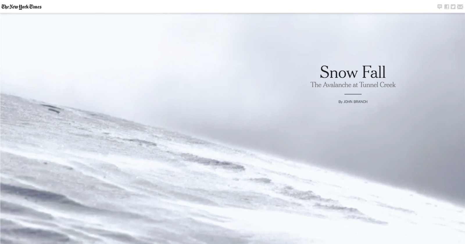
Other similar pieces include Snow Fall and Camp X-Ray to list just a few.
Advertisement
Continue Reading Below

SBS was clearly inspired by NYT to produce The Boat but this falls towards style over usability.
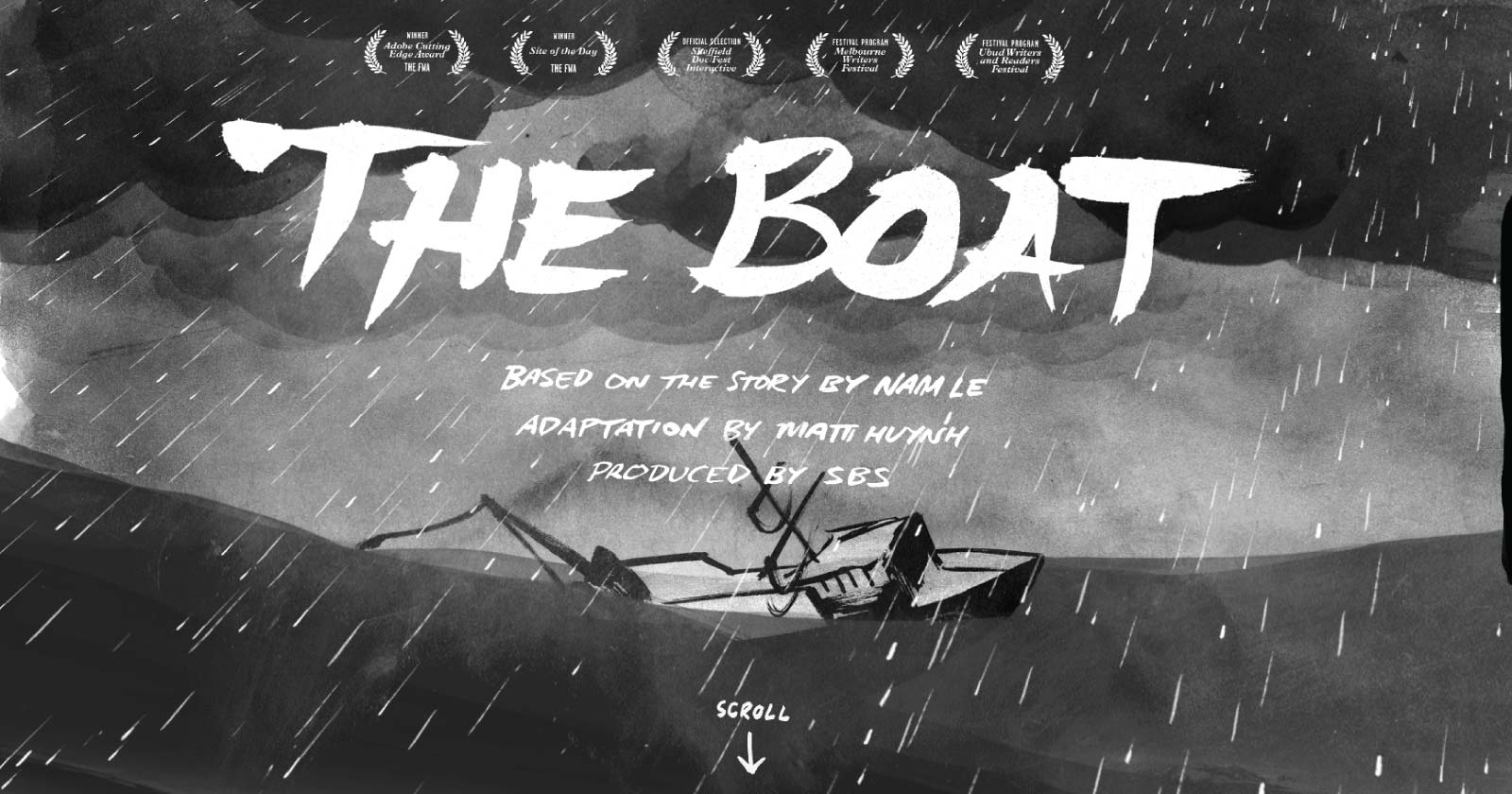

It looks stunning, but as a practical delivery of content, it’s not great. However, it won lots of awards and got attention so it was successful for brand awareness.
Apart from long-form content NYT also excel at data journalism and have produced a range of amazing data visualization and tools:
Advertisement
Continue Reading Below
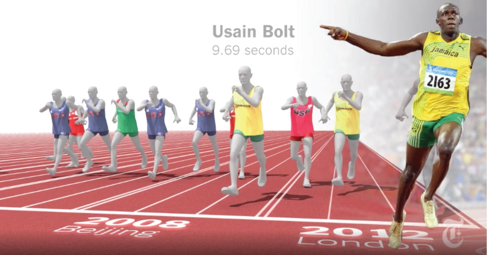

One Race, Every Medalist Ever when Usain Bolt set the new world record in 2012, the world was astounded.
When NYT created this visualization of Usain vs 116 years of Olympic sprinters, I was truly astounded.
This piece is 7 years old but still looks amazing.
How Y’all, Youse and You Guys Talk is one of the most popular digital interactive pieces for NYT.
This interactive map shows what the way you speak says about where you’re from.
Is It Better to Rent or Buy? is a calculator that went against convention to show that, in some instances, it is better to rent, not buy.
3. HSBC
We Are Not an Island
Back at the beginning of 2019, I saw a billboard in the city center where I live.
I was stopped in my tracks by how brilliant this concept was – and that doesn’t happen often.
Advertisement
Continue Reading Below
By specifically targeting cities that are known for having a high level of local pride (Manchester, Leeds, Birmingham), the ads fed into the heart that beats in all of us.
Bam, it emotionally connected.
The wording of the ads resonated with those who were from each city – HSBC had clearly done their homework.
We were still reeling from the shock of Brexit (still are) and these ads perfectly tapped into the zeitgeist of needing to belong after being set adrift.
And the genius of this campaign was how many people shared images of the posters to their friends.
HSBC knew its audience and localized its ads to regional cities.
By applying the same approach to online campaigns we can serve content tailored to different regions to make an emotional connection.
The more you can be locally specific with your content, the more likely an audience will be to connect and inclined to share with others.
4. Studio 188
Studio 188 is a group that produces “spoof” style low budget versions of major films and TV series such as, “Game of Thrones”, “Men in Black”, “Star Wars”, and “The Matrix”.
Advertisement
Continue Reading Below
The guys who do this clearly have a lot of fun.
To say something is a unique idea is saying something as there isn’t much that hasn’t been done before, but this really is a fresh creative concept.
“The Matrix” low-cost version on YouTube has nearly 1.2 million views so the idea is resonating with a lot of people.
I love spoof videos.
I talk a lot about brands like Poo-Pourri and Old Spice that disrupted stale markets and I love the use of humor in marketing.
But, it’s so difficult to get it right and for every Studio 188, there’s a lot of failed attempts.
If you know your audience and have seriously good writers or a great creative idea then try it.
The idea of the low budget version is why it works – don’t spend buckets of marketing budget just spend ages to figure out an idea that might just be crazy enough to work.
Advertisement
Continue Reading Below
5. Greggs
For years, Greggs lived in the brand wilderness until someone came along and shook up their advertising.
They adopted a cheeky approach to court publicity and incited outrage for replacing baby Jesus with a sausage roll in the nativity and turned a confrontation with Piers Morgan into social media gold.
They also did a spoof Apple advert on their new vegan sausage roll:
The pasty brand is on fire.
In Newcastle (UK), the department store Fenwick’s is respected every year for its outstanding Christmas window display.
It’s a bit like a northern Harrods.
It’s so good that queues of people stand and wait in line just to walk in front and view it – it’s a day out with the kids.
Opposite Fenwick’s is a branch of Greggs and last year people were baffled to see that they had reversed their shopfront signage.
Advertisement
Continue Reading Below
The realization that this wasn’t a mistake and was intentional is the best marketing idea I have ever seen.
As thousands of shoppers take selfies in front of Fenwick’s windows, they’re inadvertently uploading thousands of images to Instagram and Facebook with a reflected Greggs shop sign.
That year, Fenwick’s had chosen the most popular theme of ‘The Snowman’ for their display theme, possibly the most popular Christmas theme ever.
If you can piggyback from someone else’s success or exposure then it can give your brand a boost.
For example, if you have a newsletter, try to get a mention or guest edit another successful newsletter that is relevant to your audience.
Featuring influencers in your content to benefit in the bask of their social media glow has been a tactic for years – but not as easy as it used to be.
Advertisement
Continue Reading Below
Interviewing influential individuals who are responsible for a significant brand or business success makes a great case study that people want to read.
6. Leeds City Developments Map
This last piece I want to share is an example of content that is understated can often be the most powerful.
I stumbled across this piece of content by accident and was staggered by the significant amount of information it contains.
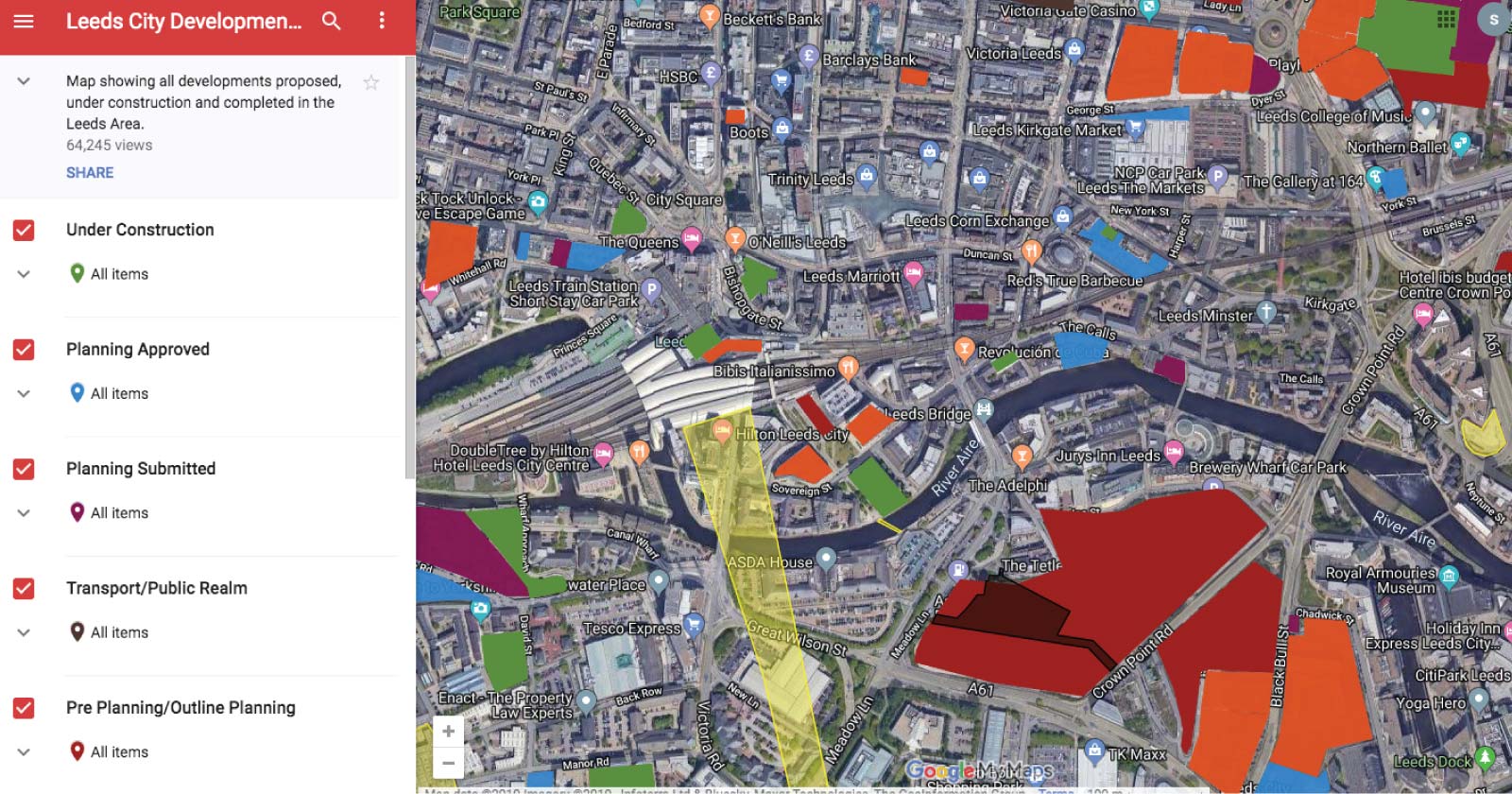

At first glance, it looks a little underwhelming, but when you start to click into it you realize that every proposed development in the city of Leeds is listed.
Not only is it listed, but you can quickly see where the proposed site is and what it might look like. The map can be segmented by developments underway, planning submitted, and proposed ideas.
Advertisement
Continue Reading Below
For someone who has an interest in property development, this is an incredibly powerful and valuable map.
Google Maps makes it easy to create content that is useful and looks great and if you can get to grips with the API you can put together some really creative stuff (I’ve produced a lot of pieces of content with Google Maps).
Curating a collection of information that isn’t widely available and presenting in an engaging way (such as a map) is usually very popular with a niche audience.
They also get a great response to outreach.
The Takeaway
Out of the six brands, here’s what we can take away to inspire better content:
- Presentation of content to engage your audience is just as important as getting the traffic to the page.
- Think like a journalist, to produce well-researched long-form content or data visualization.
- Serve content tailored to different regions to make an emotional connection.
- Concepts based on humor can be low budget and get massive results.
- Piggyback on someone else’s idea or success to give you a lift.
- Curate hard to find information to produce a valuable content asset.
Image Credits
Featured Image: Paulo Bobita
All screenshots taken by author


