Campaign Trail is our analysis of some of the best and worst new creative efforts from the marketing world. View past columns in the archives here.
Large global brands are slashing ad spend especially hard this year, with print and out-of-home (OOH) among the worst off. McDonald’s, meanwhile, is using the opportunity to embrace more traditional marketing formats with a campaign in Canada that centers around billboards, bus ads and newspaper placements.
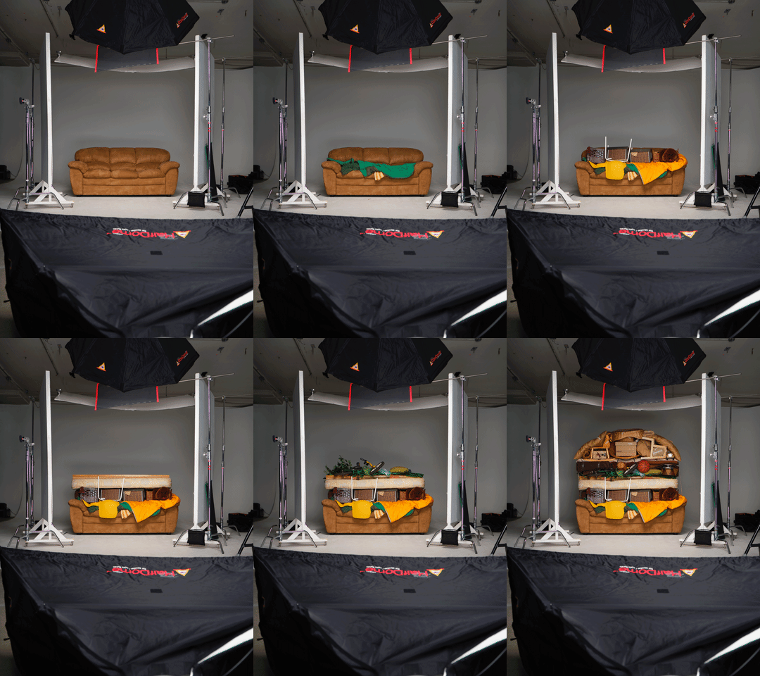
The static displays in Quebec pop visually because of their simplicity, with pared-down images showing iconic menu items from the fast foot behemoth. A Big Mac and classic red French fry box appear assembled from a cluttered pile of sofas, lamps, blankets and other home goods loaded into a truck, linking to the 270-year-old provincial tradition of Moving Day, when thousands of residents’ leases end on the same day in July. Each image was crafted to subtly tell a story of different target groups: Big Mac for a family relocating to a suburban home; fries suggest a young man heading to his first apartment; and an Egg McMuffin hints at a young couple moving in together.
This isn’t the first time the brand has employed this theme. McDonald’s and agency Cossette placed paint swatches in the form of breakfast sandwiches in 2017. This summer, it’s tying McDelivery to Moving Day for the first time as a quarantine-safe option while challenging the classic moving day dish: pizza.

Around 100 items were assembled in a studio to re-create the fast food classics.
Courtesy of Cossette
What strengthens this year’s version of the campaign is the old-school craft with which it was developed, Cossette’s Creative Director Alexandre Gadoua said. About 100 real home goods were assembled by hand in a studio to re-create the fast food classics before the final sculptures were photographed.
“The process is part of the story,” he said. “We were craving for old-school crafted, non-computerized graphics. It was refreshing, and it gives the whole piece more meaning, more depth.”
That creative theme resonates especially deeply this year, with people yearning for something real and not digital, Gadoua added.
‘Advertising at its purest form’
Billboards, bus placements and full-page ads in the local subway newspaper anchor the campaign, despite the industry’s broader decline in OOH and print in recent years. McDonald’s outdoor effort for Moving Day 2016 led to a 6.43% jump in sales from the prior year — results that point to why the chain continues to prioritize traditional channels for reaching renters and students in Quebec’s highest-populated areas around the holiday.
The restaurant’s reboot of minimalist imagery for Moving Day each year allows its agency to stretch itself to their creative limits, according to Mélanie Courtois, senior marketing director at McDonald’s Canada.
“For us at McDonald’s, we like the open brief. A few things come back every year: Christmas, Moving Day, Easter, Mother’s Day. There’s less of a brief with those and more of a ‘show us some great ideas,'” she said. “It’s a fun way for the agency to flex their creative muscle within the McDonald’s brand.”
“The process is part of the story.”
Alexandre Gadoua
Cossette, creative director
While the Moving Day effort represents just a sliver of McDonald’s global marketing initiatives, it aligns with the fast food giant’s wider creative strategy that boasts simple visuals. In February, the chain’s U.S. business introduced billboards stripped of nearly all branding, save for a strategically colored stack of words showcasing the ingredients in its core products. The minimalist route brandishes the visual identity McDonald’s has built over decades — something only a few select brands can do effectively, according to Gadoua.
“Volkswagen can do it, maybe Audi. McDonald’s is a strong iconic brand that can get away with clever, simple visuals because the logo or products say it all,” he said. “I think that’s where advertising is at its purest form.”
Prioritizing delivery
This year, Moving Day served as a key opportunity to promote the chain’s delivery service as a quarantine-safe solution for hectic days. Swapping the golden arches out for a discrete McDelivery logo in the creative’s bottom corner may prove to be particularly effective as fewer people dine in at restaurants this summer.
McDonald’s CEO Chris Kempczinksi said he expects delivery will become an enduring behavior after the chain reported higher volume of delivery orders across markets during Q2, according to an analyst call in July. Even before the pandemic, the fast food brand had run promotions featuring McDelivery’s 2019 nationwide rollout. As management indicated during the quarterly call, delivery will see a greater emphasis in marketing during the second half of the year.
The logo swap was in response to shifting consumer habits during the pandemic’s early days, a move Gadoua said solidifies the creative and “makes it less gratuitous.”
“The McDelivery logo makes this year’s work stronger and work harder,” he said. “Before, it was just us with cool visuals inviting ourselves into the conversation. Now we have something more to say.”


