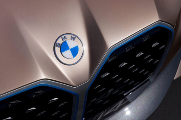
BMW has revealed a brand new logo to coincide with the release of its i4 concept car.
The classic black outer ring is now completely transparent and removal of the 3D and lighting effects have created a minimal new look. However, the circle design remains, as do the white and blue colours of the company’s home state of Bavaria.
The simplicity of the newly clear design suggests it has been refreshed with the all-pervading digital world in mind. And yet it also acknowledges the logo’s 103-year heritage – a solid example of both classic and modern logo design.
The history of the name BMW – the Bayerische Motoren Werke or Bavarian Motor Works – dates back to 1917. BMW emerged from a renaming of the aircraft engine manufacturer Rapp Motorenwerke, located in Munich, the capital of the State of Bavaria in southern Germany. Although the company name changed, the technical equipment, assets and workforce initially remained the same.
When the name BMW was first included in the commercial register in July 1917, there was no company logo. Similarly, the first advertisement lacked any BMW symbol or emblem. But what it did feature alongside aircraft engines was its future planned product range: engines for automobiles, agriculture and boats.
“In the early days, the logo and its meaning were by no means as present to a broad public as they are today, as BMW had no end customers to solicit,” explains Fred Jakobs. The main business was the production and maintenance of aircraft engines for the German Air Force.
Nevertheless, on October 5th, 1917 the young firm received a company logo. This first BMW badge, which was registered in the German Imperial Register of Trademarks, retained the round shape of the old Rapp logo. The outer ring of the symbol was now bounded by two gold lines and bore the letters BMW.
The company’s home state of Bavaria was also to be represented on the company logo. The quarters of the inner circle on the BMW badge display the state colours of Bavaria – white and blue. But they are in the inverse order as far as heraldic rules are concerned, where you read clockwise from the top left.
The reason for this inverse order of blue and white was the local trademark law at the time, which forbade the use of state coats of arms or other symbols of sovereignty on commercial logos.
The BMW logo appeared on the streets for the first time in 1923, on the fuel tank of BMW’s first motorcycle, the BMW R 32.
To what extent are contemporary trends impacting the brand reflected in the new logo?
“BMW becomes a relationship brand,” explains Jens Thiemer, Senior Vice President Customer & Brand BMW. “The new communication logo radiates openness and clarity,” he continues.
“With this new transparent variant, we want to invite our customers more than ever to become part of the BMW world. In addition, our new brand design is geared to the challenges and opportunities of Digitization for brands. With visual restraint and graphic We are equipping ourselves flexibly for the wide variety of contact points in communication at which BMW will show its presence online and offline in the future. The additional communication logo symbolises the significance and relevance of the brand for mobility and driving pleasure in the future.”


