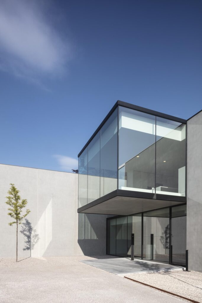
Created more as a carefully composed campus, rather than a conventional office, this heaquarters for a notary business in Bruges is the work of local Belgian architecture firm Govaert & Vanhoutte. The studio featured in our Architects Directory as an emerging practice in 2007, yet in the last ten years the then-young studio grew in leaps and bounds to become the international, prolific outfit it is today.
‘What hasn’t changed, is our philosophy,’ explain founders Benny Govaert and Damiaan Vanhoutte. ‘We have always felt a correlation between the suprematist work of the Russian artist Malevich and our conceptual language. […] By suprematism he meant the domination of the pure emotional experience in art, as opposed to the figurative. We also aim to attain this abstraction, this transcendence.’
This approach is evident in the Bruges notary headquarters. Centering their design on a few, key spaces – auditoriums, meeting rooms, closed and open office – the architects created a series of volumes linked by circulation spaces and dotted with courtyards. Large openings frame the outdoors in every single room, making users forget they are indeed indoors. Simple gestures produce a luxurious, yet down-to-earth overall feel.

The whole is a minimalist composition in glass and grey concrete, put together by a geometric arrangement of clean, rectangular surfaces and low, horizontal lines and roofs. A sense of proportion and hints of nature through planting ensure the minimalist approach is infused with warmth and informed by the human scale.
Inside, the presence of wood, natural stone, carpet and white painted plaster creates playful contrasts between cool and warm, light and dark. Creating the right interior atmosphere to foster wellness and creativity was a key challenge for the architects – yet not the only one.
‘The final design was the result of a profound functional analysis of the office’s inner workflow,’ they say. ‘The business requires high levels of privacy, a flowing route for clientele circulation, as well as employee circulation, and so on, which made this design a tough nut to crack. The final design is the visual embodiment of this inner organization.’ §


