Anyone who has ever designed or lived in a townhome can tell you the biggest problem is that shared wall. While townhomes do offer a more luxurious atmosphere than standard apartments and have the added benefit of a backyard, the shared wall between two units tends to create a tunnel effect. With no windows letting in natural light, this space typically becomes utilitarian, holding a wall of storage or becoming the support for stairways. But Mexican architectural firm Pérez Palacios Arquitectos Asociados found a way to make that shared wall work, become a design element, and turn their Pachuca townhouse into a stunning, light-filled, minimalist retreat.
1 of 20
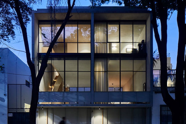
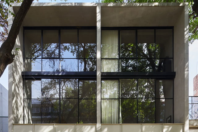
Working with a challenging site and trying to squeeze two homes onto one plot, the team at PPAA devised a plan that called for a dual townhouse. Playing with symmetry, the facade is divided in half by a central wall of concrete. The rectangular form of the structure naturally lent itself to become a minimalist showpiece. Keeping the design simple allowed for special moments to be implemented throughout both homes.
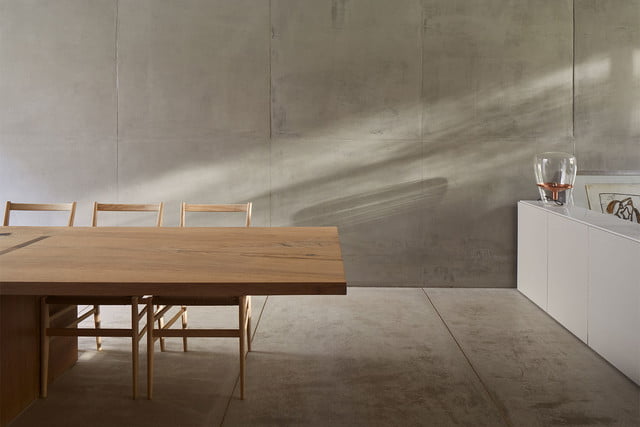
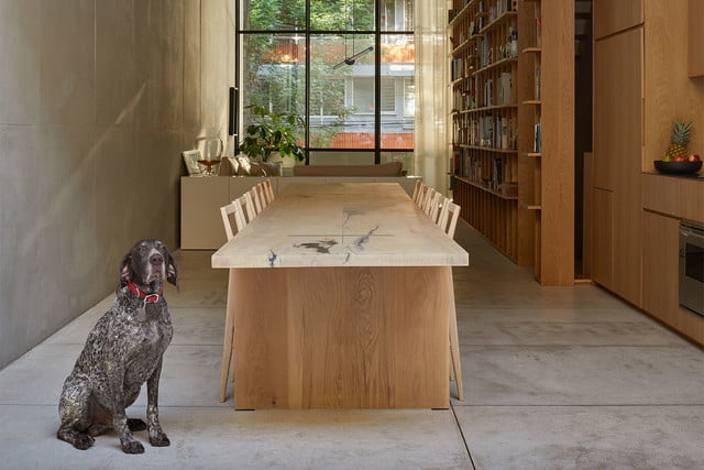
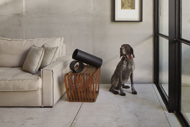
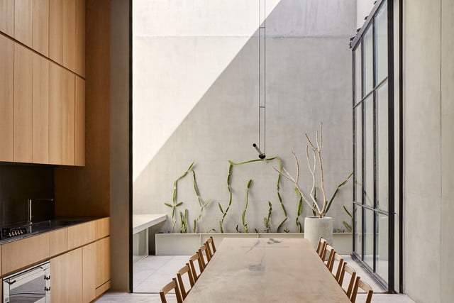
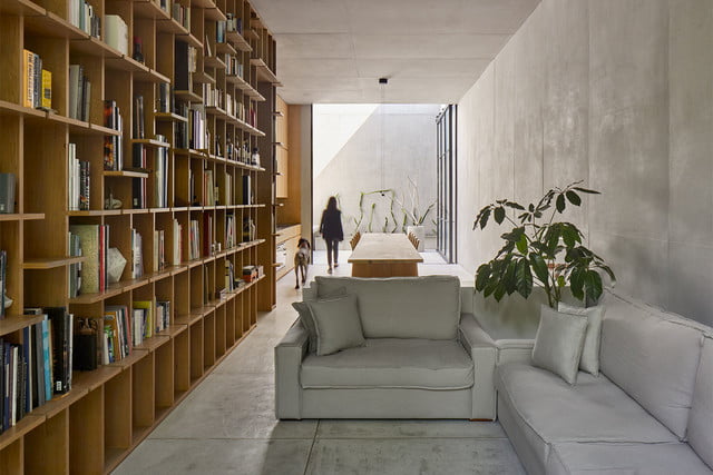
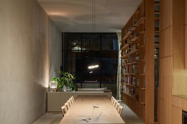
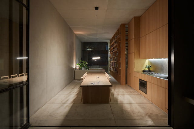
The key to making Pachuca stand out from other townhomes was finding a way to fill it with natural light and avoid the tunnel effect these homes are known for. Soft gray concrete is the main material used, forming the floors, walls, and ceilings. This light color helps the spaces feel brighter and more open, but the biggest impact was made by the walls of glass at both ends of the home. Of course walls of glass mean neighbors and anyone walking down the street can see right in, so a solution had to be put in place to address this issue.
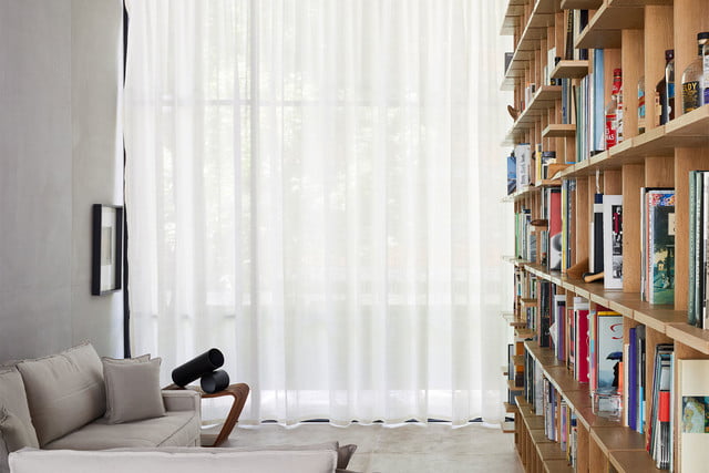
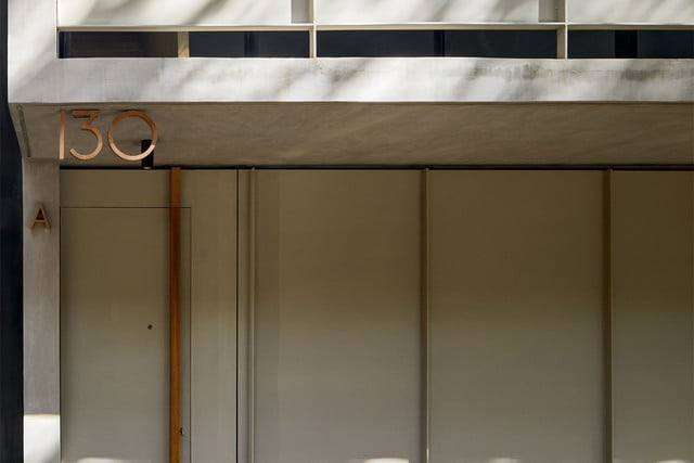
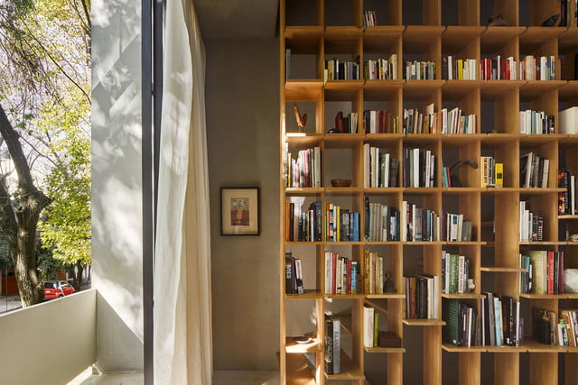
In order to provide some privacy, the different levels of the home were laid out by function. The utility spaces and garage are on the ground floor, as well as the entrances – which were painted gray to match the rest of the facade. Going up to the first floor, opaque panels that are about waist high were placed over the glass to shield the street-facing living room. Drapes were also installed for additional protection from prying eyes in the evening.
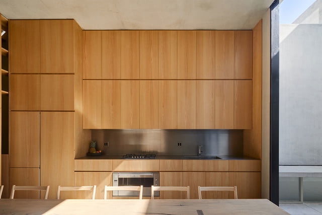
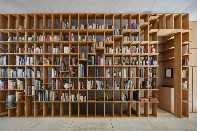
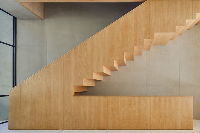
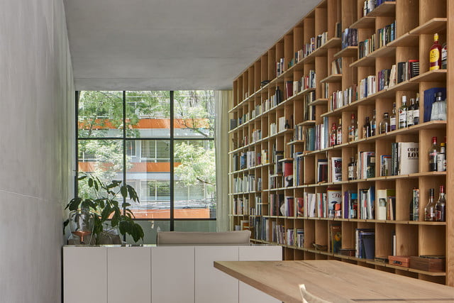
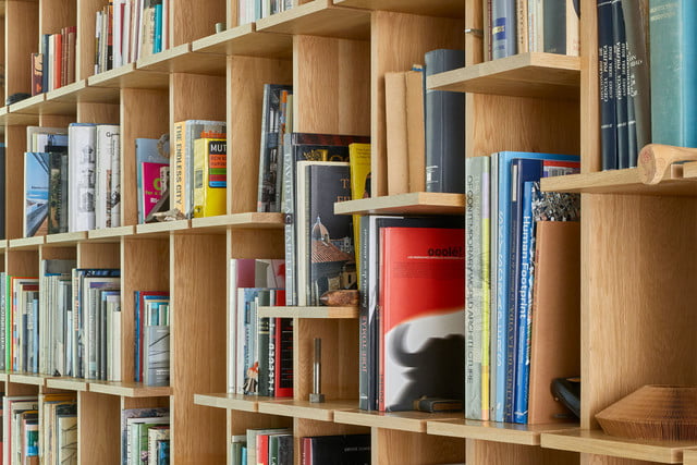
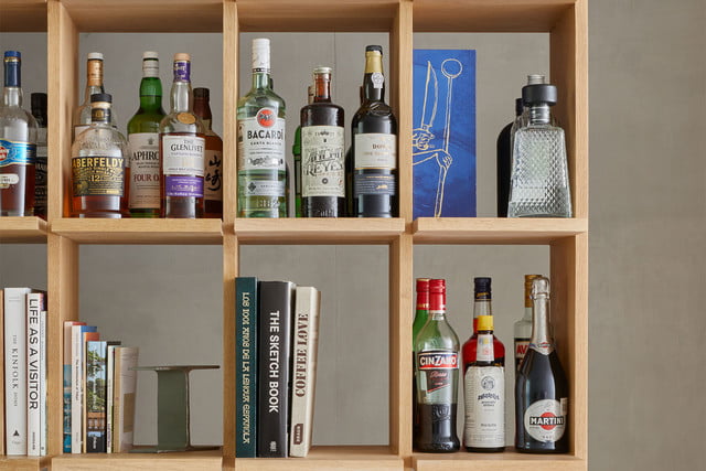
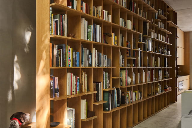
To add warmth to the light gray concrete interior, PPAA installed kitchen cabinetry, built-in shelving, and stairways of light wood. Keeping stairway treads open lets natural light filter in to the middle of the rooms. The built-in shelving was also left open, creating an interesting architectural element that connects each floor of the townhouse.
One of the most important principles of minimalist design is keeping the inside simple so that your mind can focus on the natural beauty outside. It’s hard to find outdoor spaces to relax in when you are in the middle of a large city, so PPAA outfitted each townhouse with several balconies and each home has its own private terrace.
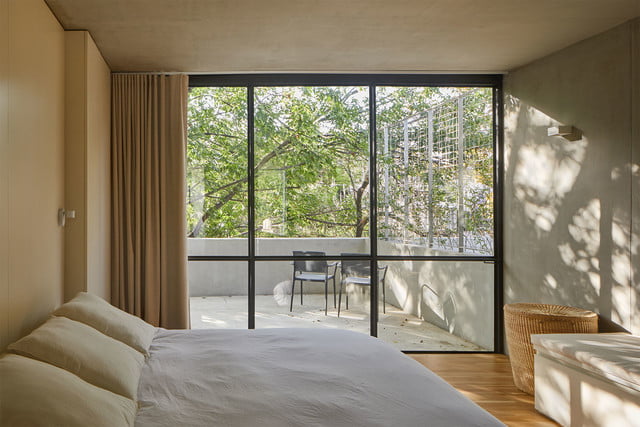
The terraces, located at the back of the homes, are accessed via a moving wall of glass that slides out of its frame rather than swinging open like a traditional door. This impressive element allows the residents to control air flow inside as well — leave the door ajar for a gentle breeze or fully slide it out to turn the dining space into an indoor-outdoor room. Finally, the top floors of the homes, where the master bedrooms are located, are also treated to private balconies. Located on the street-facing side, the balconies are protected by trees that line the sidewalk below, offering both shade and privacy.
Pachuca is a shining example of the new wave of minimalism that has been happening in Mexico and South America for some time now. Taking cues from nature, architects like the team at PPAA have been incorporating soothing tones and more concrete into their designs. This melding of minimalist principles with brutalist touches like concrete as the main material results in surprisingly soothing and luxurious spaces that are perfect for escaping from hectic city life.
