Christina Anstead of “Flip or Flop” fame has made a name for herself with her modern coastal designs. But as is clear from her new show, “Christina on the Coast,” she doesn’t always stick to her signature styles. How does she do outside her comfort zone?
In the latest episode, “Boho Flair,” Anstead is working with Sabrina and Miguel, who want her to design the kitchen and living room in their Anaheim Hills, CA, home. They have a healthy renovation budget of $70,000, but their project comes with an unusual challenge. With some areas of the house already renovated, Anstead has to match the existing boho style so her upgrades won’t seem out of place.
While boho is not Anstead’s strong suit, she’s game to give it a try. Here’s how she manages to mix and match decor styles, which might inspire some ideas in your own abode, too.
Matching kitchen cabinets and floors: A new trend?
HGTV
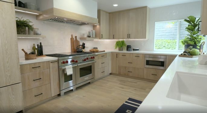
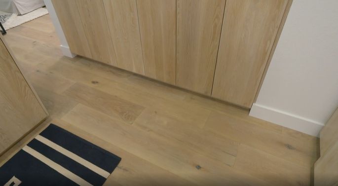
In an effort to match Sabrina’s artistic style, Anstead decides to take a design risk we’ve never seen her take before: She plans to refinish the kitchen cabinets to match the new wood floors.
HGTV
“In order for all the wood to work, all the stains need to complement each other,” Anstead says. “Otherwise, it’s going to feel random.”
When the cabinets are finally finished, the look is incredible. It’s certainly a lot of wood for one kitchen, but it looks great.
Go for paneled appliances
HGTV
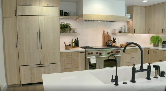
With refinished cabinets that match the wood floor, Anstead has firmly established a boho look. Still, she decides to take the look one step further by paneling the fridge with the same material!
“This is one of the first times I’ve done a paneled refrigerator,” Anstead admits. But despite her lack of fridge paneling experience, the result is beautiful.
“It doesn’t even look like a refrigerator. It just looks like a piece of furniture,” Sabrina says.
Break up the boho look with industrial accents
HGTV
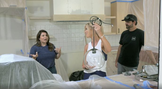
While Sabrina loves boho style, Miguel likes the industrial look, so Anstead is sure to bring in some details for the kitchen. One of those is the pendant lights above the sink—simple and sleek, perfect for this space.
When Sabrina first sees the lights, she’s certainly impressed.
“Those are so beautiful,” she says, “and again, they have that modern with a little bit of that industrial—because of the black.”
When the lights are finally installed, they look perfect. This kitchen is a fabulous combination of both of Sabrina and Miguel’s styles.
Know the right spot for a sink
HGTV
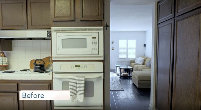
Often designers organize a kitchen layout so that the sink is situated by the window. It’s usually a great choice because the homeowner can look out the window, rather than at a wall, while doing dishes.
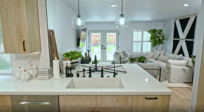
However, in this home, Anstead takes this idea a step further. She knocks down the wall between the kitchen and living room to create a peninsula, then moves the kitchen sink there.
HGTV
Anstead points out that this setup is perfect for entertaining: Miguel and Sabrina could be making party snacks or cleaning up after a dinner with friends—and still be able to talk to their guests in the living room.
“You have this huge, open area to see everyone, to talk to everyone, have people eat right here at the peninsula,” Anstead says.
Hopefully there will be a lot of parties in Miguel and Sabrina’s future!
Busy backsplashes are out, simple tiles are in
HGTV
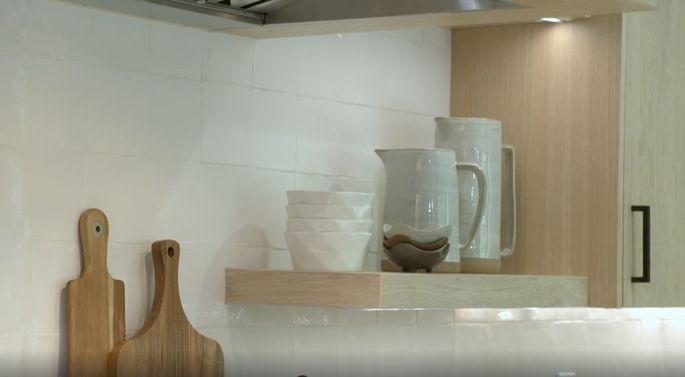
Anstead has been known to choose bold, modern kitchen backsplashes, but for this house, she goes for a minimalist look.
Since Sabrina and Miguel want a clean, fresh boho vibe, Anstead picks out a plain white tile that will allow the other design aspects to shine.
“I love the simplicity of it,” Anstead says of the backsplash tile, “and it makes the cabinets and everything else pop.”
Windows aren’t always a good thing
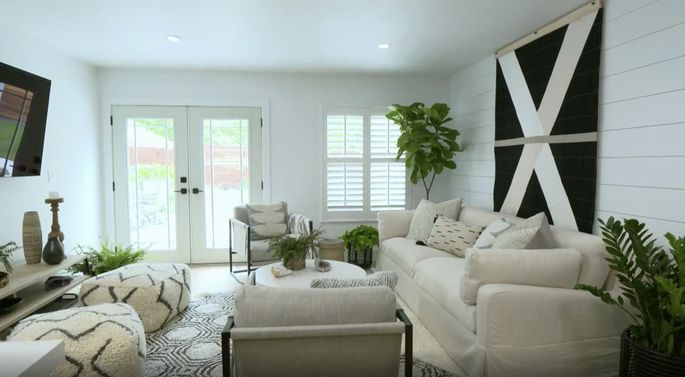
Sabrina and Miguel want a comfortable living room where they can kick back and watch TV. But there’s a lot happening in one corner of the room: There’s the back door, a large window, plus the TV.
So, Sabrina and Miguel consider removing one window.
HGTV
“We were thinking that canceling out the window would probably be the best option in order to center the TV,” Sabrina says, “but also to get a little more room for bar stools where the peninsula’s going to be.”
They spend an extra $1,500 taking out the old window, but when the living room is finished, it’s a remarkable transformation: Without the extra window, the space looks less cluttered.
All in all, from removing a window to matching kitchen cabinets with floors, Anstead’s latest design is a refreshing change. It’s unlike anything she’s done before and, in the end, this boho-industrial design is exactly what Sabrina and Miguel wanted.
“I honestly never thought I could have such a beautiful space,” Sabrina says.


